A common UI design that is applied to many mobile applications is to have an image serve as the background. This is a question that I see asked multiple times on the Ionic Forums, so I thought I would take a moment and outline the best approach to achieving this effect.
If you only need to attach your image to a specific page, just go to that page’s .scss file and define the –background variable. Here, I will set the image to reference a bg.jpg file I have in my assets directory, as well as set the parameters of how it should be rendered.
Note, the path to the asset is relative to the page’s directory.
But what if you wanted that image to be used across all of the pages? You could then move the code to the global.scss file. Since this is now being applied a global level, we need to adjust the url path:
This initially will work, but watch closely when we transition from screen to screen. The background image will either shift or blank out for a moment.
This is due to the fact that the ion-content component that we have targeted with our CSS, is being destroyed when we navigate from screen to screen. To solve this we need to remember that Ionic at its heart is still just the web. So rather than focus on Ionic’s web components, we can think about what other HTML elements we might be able to use.
The answer is to have the body tag be the element that we attach our image to. So, in the global.scss file we can add:
body {
  background: url(/assets/bg.jpg) no-repeat center/cover fixed;
}
However, if you just made that change, you will find that the image no longer is visible. This is because the default values for ion-content are being applied. Meaning, the fill color is now being used, thus covering our image. To solve this, we need to override that with:
ion-content {
  --background: none;
}
And now we will have a nice static background for the application.
Want to learn how to use Adobe XD in your workflow? I will be giving an online training course through UXPA on August 1 and August 8, 2018. This workshop will first introduce you to its design tools, once we have our design in place, we will use its built-in prototyping features to create an interactive demonstration of our design. We will go further by showing how we can share our concepts with teammates, clients or even conduct user tests. Finally, the workshop will teach you how to take your project and export the content to the development team, as well as create a design spec.
Recently I started thinking about designing some Ionic applications specifically for larger physical screens (tablets and desktop). I wanted to have a layout much like Slack or Flickr for my iPad.
The basics of this layout are to have a fixed series of icons (tabs) displayed vertically on the left side of the window, and the rest of the window displays that tab’s content. However, currently, the Ionic Tab component can only be positioned horizontally at the top or bottom of the window. To solve this I turned to the SplitPane component.
This component allows me to have two separate containers (a sidemenu container and the main content container) that I can adjust and populate with content. However, the sidemenu will typically respond to various screen widths. Since I want the element to always be visible regardless of the width, I just needed to include the ‘when’ attribute to the ion-split-pane component and set its value to ‘xs’. See the documentation for the other allowable values.
By default, the width of the sidemenu is between 270px and 28% of the window. Since I just wanted a single row of touchable icons, I need to override this. When I first began playing with this component, those values were not directly exposed, but after filing a GitHub issue, they are now available as Sass variables.
In the variables.scss file, is simply add the following variables:
$split-pane-ios-side-min-width: 70px;
$split-pane-ios-side-max-width: 70px;
$split-pane-md-side-min-width: 70px;
$split-pane-md-side-max-width: 70px;
Adding my Tabs
With the container ready, I could move on to the next step, creating the tabs themselves. Each tab was going to be a simple button component like this:
I repeat this for the other tabs I wanted to display. Since I was not using the Tab component, the state management was going to become my responsibility. To handle the visual feedback, I add the following code to each button:
[color]="isList ? 'primary' : 'light'"
This code will set the color of the button based on the boolean state of the variable isList. If it is true, Ionic’s primary color will be used, otherwise, the light color will be applied. I added this to each of the remaining buttons, changing the variable for each button.
The final piece was to add a click handler to each button so I could switch the main content.
(click)="togglePage('List')"
In the app.component.ts file, I added that function. For this demo, it handles the state swapping and basic page navigation:
Note: You do need to include the @ViewChild into your component and the proper imports as well.
Now, I have a basic working tab system!
Centering the Tabs
I decided to challenge myself a little further and wanted to have the tabs be vertically centered. Since we can safely use Flexbox, this is actually straight forward.
Rather than adjusting an Ionic tag directly (and possibly some unknown cascade), I wrapped my buttons in a new div and gave it a class of ‘centervert’. The CSS is:
The trick to making this work is to set the height of the div to be 100%. This tells the webview how to calculate the proper positioning. Here is what the app looks like:
Vertical ‘Tabs’
I did add a Footer component to have App settings and Log Out button be anchored to the bottom of the column. The content pages are just Ionic generated stubs. I have posted the source for the shell of the application on my GitHub repo. Have fun!
I am honored to be speaking on Adobe XD at this year’s Big Design Conference in Addison, Texas in September. With my long history of user experience prototyping, Adobe XD is a welcomed addition to my arsenal of tools. Here is the description of the talk:
Go from idea to prototype faster with Adobe Experience Design CC (Beta), the first all-in-one cross-platform tool for designing and prototyping websites and mobile apps. In this session, Chris Griffith will show you how to design and prototype a complete experience using the new Adobe XD app. Learn tips and tricks to immediately be more productive creating a great user experience. He will introduce you to the capabilities of this rapid prototyping tool from its repeat grid to the built-in UI kits. He then will go further and show you how to share your work, gain feedback and even view it on your mobile device.
In this post, I am going to dig a little deeper into working with the new Ionic Split Pane component. I explored it some in this post. There are three elements I want to explore: a full header design, understanding how to navigate pages, and handling resizing.
Full Header Design
Several readers asked about how you might achieve this design:
A full header Ionic Split Pane
After playing around with different variations of the component structure and encountering some navigation troubles, I settled on using a basic CSS approach to this design.
The app.html is a standard component (sorry spacing with the brackets, blame WordPress):
This file contains bidirectional Unicode text that may be interpreted or compiled differently than what appears below. To review, open the file in an editor that reveals hidden Unicode characters. Learn more about bidirectional Unicode characters
This should look very close the documentation from Ionic. All we need to do is update the app.scss file with two changes:
This file contains bidirectional Unicode text that may be interpreted or compiled differently than what appears below. To review, open the file in an editor that reveals hidden Unicode characters. Learn more about bidirectional Unicode characters
The first change removes the line that divides the two headers. This line actually runs down the entire right side of the pane. So, with the second change, we restore the line back to the default style of a solid 1-pixel line of medium gray.
We still have two headers, but by not including any visible text in the main header, we initially have the illusion of a single header.
Handling Resizing
Here is where I encountered one of my first issues. The design worked fine in desktop sizes, but when I reduced the width below its breakpoint, my pane would disappear and along with it, my title.
The component has an event listener for when a pane state change is triggered. So, I changed my < ion-split-pane > tag to include (ionChange)=”updateTitles()”.
Now, I just needed to manage what the visible state of the pane is, and the broadcast this state to my other pages, so they could replace the empty title with my pane’s title.
Here is my app.componet.ts code:
This file contains bidirectional Unicode text that may be interpreted or compiled differently than what appears below. To review, open the file in an editor that reveals hidden Unicode characters. Learn more about bidirectional Unicode characters
We define a menuToggleState boolean to hold our pane’s visible state. This variable is set once the platform is ready. We have hard code the breakpoint to match the split panes. If you change that value, you will need to update it here as well.
The key to this solution is using the Ionic Events module to broadcast this value upon a state change triggered by the IonChange event. When that event occurs, we check the new width, and determine of the pane is now showing or not. Then we publish our custom event throughout our Ionic app.
In each page that is shown with the main content, I adjusted a few items. First, I had the title component is bound the title variable.
This file contains bidirectional Unicode text that may be interpreted or compiled differently than what appears below. To review, open the file in an editor that reveals hidden Unicode characters. Learn more about bidirectional Unicode characters
When we do not want a title visible, we set this variable to hold a space, rather than an empty string. The reason for this is, without content in the node, Ionic did not properly display any header icons. We also include a button that will auto display our hamburger menu icon when the split pane is hidden, giving us access to that content.
In the component’s code, we need to add the event listener for our custom event we broadcast from the resize action. Here is the full code:
This file contains bidirectional Unicode text that may be interpreted or compiled differently than what appears below. To review, open the file in an editor that reveals hidden Unicode characters. Learn more about bidirectional Unicode characters
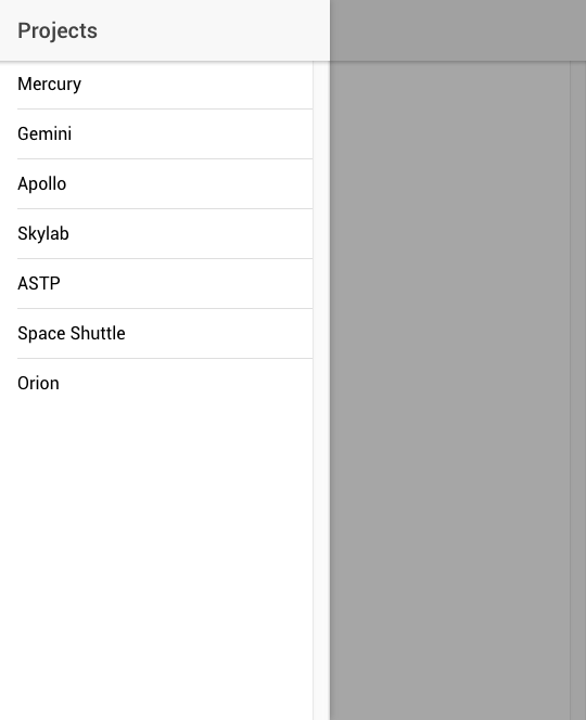
This is for the Project Mercury page, each NASA project page has the similar event subscriber included in its constructor. For this sample, I did not rework this into a custom component to properly encapsulate the code as to not need to repeat so much of it across all these pages. The basic structure of the code listens for the event from the master component and depending on the state updates the title variable.
Now when I resize the window smaller than the breakpoint, the title is updated on the main content pages. Here is what it looks like when resized:
and the menu being displayed:
Page Navigation
Another tricky part of working with the split pane is understanding how to navigate pages. It was this issue that forced me to abandon several other attempts at a full header design. The heart of updating the main content from the pane is to use the @ViewChild.
Within the class for the app, we define our ViewChild to come from our root NavController using @ViewChild(Nav) nav: Nav;
Now, we can properly reference it in our component, and navigate correctly. Our list of manned NASA projects will call the projectSelected function when clicked and pass along which page to navigate to:
This file contains bidirectional Unicode text that may be interpreted or compiled differently than what appears below. To review, open the file in an editor that reveals hidden Unicode characters. Learn more about bidirectional Unicode characters
This function tells the nav that we referenced with the @ViewChild to set it’s rootpage to the project component we stored within our array and that is passed into this function. We also use the MenuController, to automatically close the pane if it is being shown like a normal sidemenu.
Navigation within the Main Content
If you want to have navigation with the main content to a new page, the normal navigation methods work just fine. In the sample, if you click on the NASA meatball logo, it will navigate to a new page showing the NASA worm logo. Clicking the worm logo will return you to the meatball page. However, you can now see the UX issue of having the hamburger menu and the back navigation control. But, the purpose of this exploration with just to get the core functionality working, and not worry about the UX issues. That is left to you and whatever your app’s design might be.
Hopefully, this brief look further into the Split Pane component is useful. The sample code can be found in my GitHub repo. If you are wondering why I picked NASA as my sample, you can visit my other blog, https://spacequest.wordpress.com/ to learn why.
Many of you might know, I enjoy a fine craft brew from time to time, and living in San Diego, one of the best microbrewery towns certainly helps. To keep track of my various tastings, I use the Untappd service (here is my profile). The app follows many of the same ideas as Foursquare; instead of places you check in with a beer. They also have a badge system among other features you would expect from a social media service.
What is interesting about the app is some of it’s history. Originally, this service was only available as a web app. A fact they were quite proud of. I would usually refer to them as the example of going the web app route versus building a native application.
Recently, they made the leap into the native app realm, by wrapping their web app with PhoneGap. This makes good sense given their previous investment. But this blog post is not about this choice, but rather to talk about a UI choice.
untappd iOS home screen
Take a look at the initial screen from the iOS version of the app. What has focus?
If you said ‘Drink Up’ or the larger yellow tab with beer bottles, you would be wrong! Instead, it is the Friends tab. So many times, I go to check in with a beer and begin typing the beer’s name in the search field only to be informed that the beer can not be found in my friends. Then I remember that I need to switch tabs to log my beer.
untappd Drink Up screen
Why do I make this error? Well the designers have placed more visual emphasis on the Drink Up tab than then other tabs. By adding this visual weight to the element, a casual glance of the UI would lead the user to assume that the Drink Up tab was selected and the screen’s contents were based on that selection. In addition, except for the hint text in the search field, there is no difference in the top portion (about 20%) of either screen.
Now, logging your beers is the primary task of this app, and hence the reason for the visual emphasis for the tab’s look and feel. But what fails is that this tab is not automatically selected focus. It is an easy fix, programmatically set the default state to the Drink Up tab. One could go a bit further and maybe repeat the icons that are used on the tabs next to the search field. Let’s face it, this is an app you will use with alcohol! 😉
So, as you develop your next great mobile application, take care in what you provide focus on and how this reflected in the code. Now what’s in my ‘fridge to drink…
I am a little late in getting around to writing about the second Designer/Developer Workflow Conference (aka D2WC) in Kansas City, Mo. This is the second time I had the pleasure of speaking here. This year’s topic was on Designing Great Mobile Apps. This was an expanded version of the talk I gave at 360|Flex. I had a wonderful time presenting it, and enjoyed all the follow up conversations.
The conference was fantastic! All the sessions I attended were well done and informative. In many cases I had to make hard choices between sessions. I only hope the recordings turn out. It was great to have some wonderful chats with the attendees.
I want to thank Dee Sadler for hosting yet another great event, and look forward to next year’s (where ever it maybe).
For a deeper write up on the conference, take a moment at read Chad Udell’s post (who I also enjoyed his preso at the conference) and Mark DuBois’ as well.
Flash Catalyst CS5.5 represents an important step forward in the Flex-based designer/developer workflow. As Flex-based applications become more visually rich, more technically complex, and more prominent in the enterprise, the ability to prototype and create visually accurate applications becomes even more critical.
I will also be raffling off a copy of Flash Catalyst CS5.5! Hope to see you there.
I had the extreme pleasure of speaking at the recent 360|Flex Denver conference. The conference was incredibly well done, John, Nicole, and their assistants did a fantastic job!
Besides working on the mobile apps for the show ( we are still trying to figure out the session survey upload issues), I presented on “Designing Great Mobile Apps” on Tuesday afternoon. I had a lot of fun giving the presentation, even with two Adobe evangelists and one Adobe product manager in attendance (and the great Dee Sadler as well)…
I hope these slides are useful, the session was recorded by the folks at ZaaLabs, so I will let you know when it is ready. Please feel free to ping with questions or comments.
Now go build something!
[Update]
If you are interested in some resources on mobile design I would also suggest they following books:


 Prototype A
You must be logged in to post a comment.