Design

Ionic Design: Profile Page

When reviewing questions on the Ionic Forums, I often see questions that are frequently asked. I recently saw a request for help about creating a profile screen, and since I was working on similar features, so the request for help on implementing the design of this profile screen came at a good time.

dribbble-profile

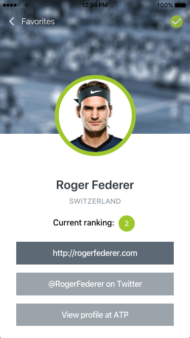
The original design in this example was done by Sebastian Heit and was posted on Dribble. Before we dive into the code, let’s break down the design into sub-tasks to help focus the effort. First, this design has a transparent header and a full-width image as a header graphic. Next is the avatar image, Roger Federer, that sits in between the header image and the lower section. This is a standard design for many profile screens. Beneath the avatar is some player information and some social media buttons. The sample on Dribble included some tabs, but for my attempt, I will ignore that design element.

To recreate this design I needed to obtain visual elements. The header graphic (in this case a tennis court) and a headshot of Roger Federer. I found a nice profile image of Roger Federer without any trouble. For the header graphic, I searched Flickr for a suitable substitute. I found this image by Zepfanman.com, and it is available to be used by me.

Isner v. Kohlschreiber, Part III

I brought the image into Photoshop to apply the blue tint and the blur effect, giving me this result:

Isner v. Kohlschreiber, Part III

The revised image.

Getting Started

I generated a new Ionic blank template: $ ionic start profile blank –type=angular, then copied the background image and the avatar image into the newly created assets folder in the project directory.

Step 1: Transparent Header

The first styling task that I wanted to take on was to make the header transparent. Since Ionic’s header component supports this style, I just needed to add a translucent attribute to the ion-header tag. By itself, this will only make the header transparent while the ion-content will still be positioned under the header. This means if our content were to scroll, it would not scroll under the header. If that is what your design calls for, you need to add the fullscreen attribute to the ion-content as well and set it to true.

In the HTML template, I added buttons that were in the design; a button with an icon of the Back arrow with a label of Favorites and, a Checkmark button. Since this is not in a real app, the Back Arrow is an actual button in my sample. Typically, this would be an Ionic Back Button component in order to pick up the built-in navigation features.

Another thing to note is the checkmark button. Ionic’s icon library has that icon available. There was one minor issue with it in that the interior checkmark was transparent. This did not match the design, so I took the source SVG file and made a quick edit to change this. I saved this new version of the icon into the assets folder as well. That ion-icon will use the src attribute to point to my icon instead of the name attribute which will use the Ionicon library.

Header Image

The next step in recreating this design was applying that header image I prepared earlier. Switching from the HTML template file to the .scss file, this I can set the –background variable of the ion-content component to point to the background graphic. Positioning is set to be the top and center. As for how the image should be shown in the viewport, I opted for cover and fixed. I also did not want it to be repeated, so I included the no-repeat option.

In the .scss file, I also made sure that the ion-toolbar‘s background was transparent by setting its background variable to transparent.

If you save both files and run $ ionic serve in the command line, you should see the image being applied to the background and also under our transparent header.


<ion-header translucent no-border>
<ion-toolbar>
<ion-buttons slot="start">
<ion-button color="light">
<ion-icon slot="start" name="ios-arrow-back"></ion-icon>
Favorites
</ion-button>
</ion-buttons>
<ion-title>&nbsp;</ion-title>
<ion-buttons slot="end">
<ion-button>
<ion-icon slot="icon-only" src="../../assets/checkmark-filled.svg"></ion-icon>
</ion-button>
</ion-buttons>
</ion-toolbar>
</ion-header>
<ion-content fullscreen="true" slot="fixed" >
<div class="ion-padding">
The world is your oyster.
<p>If you get lost, the <a target="_blank" rel="noopener" href="https://ionicframework.com/docs/">docs</a&gt; will be your guide.</p>
</div>
</ion-content>

view raw

home.html

hosted with ❤ by GitHub


ion-content {
–background: url(../../assets/background_full.jpg) no-repeat top center/cover fixed, #fff;
position: relative;
height: 100%;
width: 100%;
}
ion-toolbar {
–background: transparent;
}

view raw

home.scss

hosted with ❤ by GitHub

Now to add the avatar image and the player content.

Step 2: Player Avatar

Creating the avatar portion of the design will be done using various divs and applying the correct CSS positioning types. Let’s being by defining the HTML structure. To begin, we will wrap everything in a basic div and give it a CSS class of card. This div will act as our master container for our content. Next, we will add another div that will provide the vertical spacing needed to show the rest of the header image. On that div, we will set the class to header.  Within the header div, another div is added, which will be used to position the avatar image. Here is the full HTML snippet:


<div class="card">
<div class="header">
<div class="avatar">
<img src="../../assets/player104.png" alt="">
</div>
</div>
</div>

view raw

home.html

hosted with ❤ by GitHub

Switching to the home.page.scss file, we will add the CSS needed to style and position the avatar. The card class will center the content horizontally by setting the margin value to be 0 and auto. Then set the header class to define the height of the div to be 200 pixels. The avatar class is where the heavy lifting will begin. The width and height of this div will be the desired width of our avatar image. The critical CSS that needs to be applied is setting the position attributes value to relative. For good measure, we will set the margin to be 0 and auto (to ensure centering horizontally). Within the avatar div, the image tag will be defined by setting its source to a nice profile photo of Roger Federer. It is on the image tag that CSS will make our avatar how we want it. First, the display type is changed to block from inline. Next, the border-radius is set to 50% to generate a circle around the image. The border property is set to be 8 pixels, solid and our green (#9DC912). In case the image has transparency, set the background color to white. Otherwise, our header image will be visible inside the avatar. Those properties will get our shape and style correct, but will not solve our positioning needs. To fix that, change the position property to absolute. This will allow us to place the image where we want it. Since its parent’s position is relative, it will be set absolute with respect to its parent and not the page. However, we still need to define what that absolute location is. Here we can leverage the CSS calc function to solve this. While I could have supplied a pre-calculated number, I wanted to demonstrate the math behind the value. The goal of the calculated number is to place the image half-way down its height (including the border). In this case, it is 80 pixels (half the defined avatar width) + 4 pixels (half the border width) times -1, so that image is moved downward.


.card {
margin: 0 auto;
.header {
height: 200px;
.avatar {
width: 160px;
height: 160px;
position: relative;
margin: 0 auto;
img {
display: block;
border-radius: 50%;
position: absolute;
bottom: calc(-1*(80px + 4px));
border: 8px solid #9Dc912;
background-color: #fff;
}
}
}
}

view raw

home.scss

hosted with ❤ by GitHub

Here is what the screen should look like at this point:

avatar-1

Since there is no additional content yet, the avatar will be ‘floating’ over our background.

Step 3: Player Information

With our avatar in place, we can turn our attention to the player information portion of the design. This portion is mostly a collection of traditional HTML tags, along with the ion-chip component and the ion-button component.


<div class="card-body">
<div class="user-meta ion-text-center">
<h3 class="playername">Roger Federer</h3>
<h5 class="country">Switzerland</h5>
<h6 class="ranking">Current ranking: <ion-chip>
<ion-label>2</ion-label>
</ion-chip>
</h6>
</div>
<ion-button expand="full" color="primary">http://rogerfederer.com</ion-button&gt;
<ion-button expand="full" color="secondary">@RogerFederer on Twitter</ion-button>
<ion-button expand="full" color="secondary">View profile at ATP</ion-button>
</div>

view raw

home.html

hosted with ❤ by GitHub

The CSS for the card-body is where we need to set two things; the background color (white) and the height. If we don’t set a height value, this div might not fill the screen. To solve this, the CSS calc function will come to rescue again. This time we will take the full height (100vh) and subtract the header height we defined (200 pixels), as well as the toolbar’s height (56 pixels). We will also adjust the spacing, font size, weight, and color of some of the other elements as well.


.card-body {
background-color: #ffffff;
padding: 30px;
height: calc(100vh – (200px + 56px));
overflow: hidden;
.user-meta {
padding-top: 40px;
.playername {
font-size: 24px;
font-weight: 600;
color: #303940;
}
.country {
font-size: 90%;
color: #949ea6;
text-transform: uppercase;
margin: 0 auto;
}
}
}

view raw

home.scss

hosted with ❤ by GitHub

For styling the ion-chip, we just need to set the –background variable to #9DC912 and the –color variable to #fff.

The final touch is to set the overall CSS variables to align with our design. Using the Ionic Color Generator I altered the color set. Here are the changed color values:

  --ion-color-primary: #5c6a76;
  --ion-color-primary-rgb: 92,106,118;
  --ion-color-primary-contrast: #ffffff;
  --ion-color-primary-contrast-rgb: 255,255,255;
  --ion-color-primary-shade: #515d68;
  --ion-color-primary-tint: #6c7984;

  --ion-color-secondary: #9ba4ac;
  --ion-color-secondary-rgb: 155,164,172;
  --ion-color-secondary-contrast: #ffffff;
  --ion-color-secondary-contrast-rgb: 255,255,255;
  --ion-color-secondary-shade: #889097;
  --ion-color-secondary-tint: #a5adb4;

  --ion-color-tertiary: #303940;
  --ion-color-tertiary-rgb: 48,57,64;
  --ion-color-tertiary-contrast: #ffffff;
  --ion-color-tertiary-contrast-rgb: 255,255,255;
  --ion-color-tertiary-shade: #2a3238;
  --ion-color-tertiary-tint: #454d53;

  --ion-color-success: #9dc912;
  --ion-color-success-rgb: 157,201,18;
  --ion-color-success-contrast: #ffffff;
  --ion-color-success-contrast-rgb: 255,255,255;
  --ion-color-success-shade: #8ab110;
  --ion-color-success-tint: #a7ce2a;

If you have not worked with adjusting the global variables, these are defined in the variables.scss file. With that, we have recreated the profile screen!

profile-2.png

The full source can be found at: https://github.com/chrisgriffith/ionic-profile-design Feel free to ping me with questions or other design challenges in Ionic.


Dynamic Ionic Theming

With the shift to CSS variables for much of the styling of the Ionic components, a popular question on the Ionic forums is “How do I dynamically change the look my application at runtime?” For example, wanting a light or dark theme, or have the controls match the logo colors of your favorite sports team. In this post, I am going to show you the basics for doing this. To begin, generate a new Ionic application:

$ ionic start themedemo blank --type=angular

Once it is finished generating, open the home.html. Let’s replace the template code with the following:


<ion-header>
 <ion-toolbar>
   <ion-buttons slot="secondary">
     <ion-button fill="outline">
       <ion-icon slot="start" name="star"></ion-icon>
       Star
     </ion-button>
   </ion-buttons>
   <ion-title>Theme Demo</ion-title>
   <ion-buttons slot="primary">
     <ion-button color="danger" fill="outline">
       Edit
       <ion-icon slot="end" name="create"></ion-icon>
     </ion-button>
   </ion-buttons>
 </ion-toolbar>
</ion-header>
<ion-content>
 <ion-button (click)="colorIt()">Color Theme</ion-button>
 <ion-button (click)="setTheme('dark')">Dark Theme</ion-button>
 <ion-button (click)="setTheme('light')">Light Theme</ion-button>
</ion-content>

view raw

home.page.html

hosted with ❤ by GitHub

This new template has some elements in the ion-header and three buttons that will we can use to alter the applied CSS variables.

Let’s set up the CSS variables that we will be interacting with, open the variables.scss file that is located in the theme directory. If you have not worked with this file before, this is where all the default Ionic theme colors are defined; primary, secondary, etc. In the :root declaration, we are going to add two new variables that we will be changing via our code. Add a –mycolor variable and set its value to rebeccapurple, and another variable –mytextcolor and define its value as #fff. Your variables.scss file should look like this at the start:


:root {
 –mycolor: rebeccapurple;
 –mytextcolor: #fff;
 /** primary **/
 –ion-color-primary: #3880ff;
 –ion-color-primary-rgb: 56, 128, 255;
 –ion-color-primary-contrast: #ffffff;
 –ion-color-primary-contrast-rgb: 255, 255, 255;
 –ion-color-primary-shade: #3171e0;
 –ion-color-primary-tint: #4c8dff;
 …more…
}

view raw

home.page.scss

hosted with ❤ by GitHub

With our two variables now defined, we can now apply them. Open the global.scss file. This file is the proper place for setting any global CSS to our application. In this simple example, we are just going to change the background color and the text color of our Ionic toolbar. By checking the Ionic documentation on that component, there are two defined CSS variables for those properties; –background and –color respectively. If we just want to override the values, we could set them directly like this:


ion-toolbar {
   –background: rebeccapurple;
   –color: #ffffff;
}

view raw

global.scss

hosted with ❤ by GitHub

Unfortunately, we can not directly assign a CSS variable to another in this fashion. Instead, we need to declare it as a var before we can set the value of the property. To do this, we change our CSS to use the var function (https://developer.mozilla.org/en-US/docs/Web/CSS/var):


ion-toolbar {
   –background: var(–mycolor);
   –color: var(–mytextcolor);
}

view raw

global.scss

hosted with ❤ by GitHub

If you saved all the files and ran $ ionic serve, you should see your header’s toolbar in a nice purple and the text in white. Since there are no methods for those buttons to call they won’t function (and odds are your editor might be warning you about that fact).

Switching to the home.page.ts file, let’s add those methods. After the class definition, add an object that will define our theme colors. For more robust theming I would suggest creating a service or module that contains your theme management, but this example we will not add that level of complexity. Here is our new variable:

theme = {
  mycolor: 'rebeccapurple',
  mytextcolor: '#fff'
};

Currently, the Blank template’s component does not include a constructor, so let’s add a basic one:

constructor() { }

For the colorIt method, I want to show you how to set the property directly. This option works well if you are setting a small number of variables. To do this we will call document.documentElement.style.setProperty() method. This method has three parameters: the property name, the value (optional), and the priority (optional). Since we are interacting with CSS variables, we can not set the property name as –mycolor. Instead, we need to wrap the CSS variable with a ` or backtick. The new value that we want to set can be wrapped with the standard single quote. Here is what the code should look like:

colorIt() {
  document.documentElement.style.setProperty(`--mycolor`, '#ccc');
  document.documentElement.style.setProperty(`--mytextcolor`, '#000');
}

 Those two lines will change the CSS variables to their new values, and trigger a repaint of the screen.

But what if swapping themes requires changing more than just a few variables? Let me show you the foundation for solving that challenge. Two of the buttons in our template called the setTheme method, each passing in a string that was a theme name (light or dark). This method will update the theme object we defined in our class with new values. But the workhorse of the method is actually the forEach loop that we will call. This will walk through each of the properties names and set their values. Here is the full code:

setTheme(userTheme: string) {
  if (userTheme === 'dark') {
    this.theme.mycolor = 'rebeccapurple';
    this.theme.mytextcolor = '#fff';
  } else {
    this.theme.mycolor = '#ccc';
    this.theme.mytextcolor = '#000';
  }

  Object.keys(this.theme).forEach(k =>
    document.documentElement.style.setProperty(`--${k}`, this.theme[k])
  );
}

If you have not seen the ${} before, this is ES6’s template notation. If you run the application now you should be able to toggle the header bar color and text color. 

theme_sample

So, there are the basics for having dynamic themes in Ionic 4. Like I mentioned, you are probably going to want to expand upon this to have a proper service or module to manage your theming across your application. Feel free to ping me with questions or other design challenges in Ionic.

Ionic Design: Using the Grid Component

One of the things that catch my eye when I am scanning the Ionic Forums is design related questions. Sometimes these are questions around styling a component, but sometimes the poster asked for a more complex design solution. I save these, and when my schedule allows, I will tackle them. This design challenge was someone looking for a solution in the layout of a card. Here is my Adobe XD clone of the initial request (I have opted not to share the initial query).

CANVAS

As you can see there is an avatar, user name, game stats, and an action button.

CANVAS2

Now I suspect the avatar might have led the poster to look at using the Ionic avatar component and in turn, the Ionic List component. Instead, I opted to leverage the Ionic Grid to solve this layout. Although there are four regions, I opted to consider this design to use two regions; one for the request button and one for the rest. While one might have chosen three regions, I wanted to make sure that the avatar was connected to the user name and game stats. By placing the user name and game stats in their own cell, it could shift positioning.

Let’s place our initial content within two columns in the Ionic grid inside an Ionic Card component:


<ion-card>
<ion-card-content>
<ion-grid>
<ion-row>
<ion-col>
<img src="../../assets/avatar.png">
<h1>Chris Griffith</h1>
<p>6W 3D 2L</p>
</ion-col>
<ion-col>
<ion-button>Register Result</ion-button>
</ion-col>
</ion-row>
</ion-grid>
</ion-card-content>
</ion-card>

view raw

home.html

hosted with ❤ by GitHub

We will focus on the text styling first. We will place the user name inside an h1 tag and add a CSS class of userName.


<h1 class="userName>Chris Griffith</h1>

view raw

home.html

hosted with ❤ by GitHub

In our scss file we will set the following properties:


.userName {
font-size: 16px;
font-weight: bold;
color: #5D5F65;
}

view raw

home.scss

hosted with ❤ by GitHub

For the game stats, we will place it in a paragraph tag. For each stat, we will wrap in a span tag and assign each a specific CSS class for wins, draws, and losses. By doing this we can leverage the border property to create the colored bar under each stat.


<p class="gameStats>
<span class="wins">6W</span><span class="draws">3D</span><span class="losses">2L</span>
</p>

view raw

home.html

hosted with ❤ by GitHub

Here is the CSS for this:


.gameStats {
margin-top: .5em;
font-size: 13px;
font-weight: bold;
color: #BBBCBE;
}
.wins {
border-bottom: 6px solid #62f254;
margin-right: .5em;
}
.draws {
border-bottom: 6px solid #edce59;
margin-right: .5em;
}
.losses {
border-bottom: 6px solid #d04749;
margin-right: .5em;
}

view raw

home.scss

hosted with ❤ by GitHub

Turning to the avatar, we can apply the border-radius property and also enforce a maximum width. We will address positioning in a bit.


<img class="avatar" src="../../assets/avatar.png" />

view raw

home.html

hosted with ❤ by GitHub


.avatar {
border-radius: 10px;
max-width: 45px;
}

view raw

home.scss

hosted with ❤ by GitHub

Our final element to be styled is the call to action button. This element will be the Ionic button component.


<ion-button>Register Result</ion-button>

view raw

home.html

hosted with ❤ by GitHub

The Ionic button will adapt to each platform, which requires overriding some of those settings, notably the border radius and the text case. For the latter, we can set the CSS variable for border-radius and the background color.


ion-button {
–border-radius: 10px;
–background: #6765F7;
}

view raw

home.scss

hosted with ❤ by GitHub

The button’s text case is not one of the listed variables. Instead, we can use of one the Ionic’s CSS utilities. For Ionic, many of these CSS styling helpers were CSS attribute selectors. But with Ionic expanding to other frameworks, these helpers have become namespaces CSS classes. So we can apply the ionic-text-uppercase case to our button.


<ion-button class="ion-text-uppercase">Register Result</ion-button>

view raw

home.html

hosted with ❤ by GitHub

That covers the basic visual styling, so let’s tackle our positioning. The Ionic grid is built upon the CSS Flexbox. Flexbox is a powerful layout solution for layout in one direction.

Since we want our content to be vertically centered, we can use the align-items-center value for a flexbox. For the Ionic grid, we declare this on the ion row by applying it via a CSS class.


<ion-row class="ion-align-items-center”>

view raw

home.html

hosted with ❤ by GitHub

Next, we need to define the positioning of our two ‘cells’. For this, we can use Flexbox’s justify-content-between to position them against either side. Again, this is done by adding in a CSS class.


<ion-row class="ion-align-items-center ion-justify-content-between">

view raw

home.html

hosted with ❤ by GitHub

Let’s deal with our avatar and the text. The solution I opted to use was to turn the image into a block level element and float it to the left. We will add some margin to the right side to bump the text over. The game stats could also use some spacing between them and the user name so we can add some margin to that paragraph tag.


.avatar {
border-radius: 10px;
max-width: 45px;
display: block;
float: left;
margin-right: 1rem;
}

view raw

home.scss

hosted with ❤ by GitHub

The button also needs some layout attention as it is currently aligned to the left of the container. What we would like is for the button to be anchored to the right edge of the container. To solve this we can apply another Ionic CSS utility class — the ion-float-right class.


<ion-button size="small" class="ion-float-right ion-text-uppercase">Register Result</ion-button>

view raw

home.html

hosted with ❤ by GitHub

The final touch is to reduce the inner spacing of our containing Ionic card component. If you scan the Ionic documentation, you will not find a CSS variable to adjust this. But fear not! Pulling up Dev tools in our browser we can see that that spacing is applied directly, meaning we can override it without difficulty.


.card-content-md {
padding-inline-start: 0;
padding-inline-end: 0;
}
.card-content-ios {
-webkit-padding-start: 0 !important;
padding-inline-start: 0 !important;
-webkit-padding-end: 0 !important;
padding-inline-end: 0 !important;
}

view raw

home.scss

hosted with ❤ by GitHub

Here is the final output running on my iOS emulator.

ios

I think the design is fairly close to what I was using a reference. To learn more about Ionic CSS Utilities, see their documentation. For more information about the Ionic grid, I suggest you read over this section in the documentation.

If you found this design exercise useful or have questions let me know.

Background Images for Ionic 4

A common UI design that is applied to many mobile applications is to have an image serve as the background. This is a question that I see asked multiple times on the Ionic Forums, so I thought I would take a moment and outline the best approach to achieving this effect.

If you only need to attach your image to a specific page, just go to that page’s .scss file and define the –background variable. Here, I will set the image to reference a bg.jpg file I have in my assets directory, as well as set the parameters of how it should be rendered.

ion-content {
  --background: url(../../assets/bg.jpg) no-repeat center/cover fixed;
}

Note, the path to the asset is relative to the page’s directory.

But what if you wanted that image to be used across all of the pages? You could then move the code to the global.scss file. Since this is now being applied a global level, we need to adjust the url path:

ion-content {
  --background: url(/assets/bg.jpg) no-repeat center/cover fixed;
}

This initially will work, but watch closely when we transition from screen to screen. The background image will either shift or blank out for a moment.

ezgif.com-video-to-gif

This is due to the fact that the ion-content component that we have targeted with our CSS, is being destroyed when we navigate from screen to screen. To solve this we need to remember that Ionic at its heart is still just the web. So rather than focus on Ionic’s web components, we can think about what other HTML elements we might be able to use.

The answer is to have the body tag be the element that we attach our image to. So, in the global.scss file we can add:

body {
  background: url(/assets/bg.jpg) no-repeat center/cover fixed;
}

However, if you just made that change, you will find that the image no longer is visible. This is because the default values for ion-content are being applied. Meaning, the fill color is now being used, thus covering our image. To solve this, we need to override that with:

ion-content {
  --background: none;
}

And now we will have a nice static background for the application.

ezgif.com-video-to-gif (1)

Centering Gallery Elements

Recently, I was rebuilding one of my websites to be responsive. It is important to take advantage of the capabilities of modern browsers and be responsive, to support the growing use of the site on mobile devices. One portion of the design was a set of image gallery pages. These pages are pretty straight-forward, up to 5 columns of photos per row centered within the width of the page. As the window width reduces, the number of columns reduces. Again, nothing out of the ordinary with this design.

figure1

Block version of the design


I began by centering the containing div by setting the CSS properties of margin-left and the margin-right values to “auto”. That positioned the containing div correctly and it responded as expected as the browser width was changed. However, as the width of the window reduced, the thumbnails would begin to start to flow down to the next row, but they would display centered within the containing div. Not exactly the design I was looking for.

Centered elements

Centered elements

I applied a float:left to the thumbnails, and my centering last row was fixed! However, it introduced a new problem–the thumbnails no longer appeared to be centered as a group within the page. Adding the float to the thumbnails introduced extra spacing between the last column and the right boundary of the containing div.

Highlighting the margin right issue

Highlighting the margin right issue

I knew that had to be solved, so I began looking at many of my favorite tutorial sites, and found nothing. Lots of great samples of gallery pages, but all using the full width of browser in their samples or the thumbnail sizes would adapt to their widths. Nothing seemed to fit my design.

Next, I decided to look at using Flexbox. I had made the choice to only support “modern” browsers, so I knew that I did not need to worry too much about compatibility issues. But the same issues remained as I experimented with the various flex layout options; the last row items would be centered, or the gap on the right existed. Back to the drawing board!

Then I got to thinking about how the layout was computed. Each thumbnail would take the same fixed amount of space. Each would position itself to the left due to setting the float property to left. If the thumbnail did not have enough space within the width of the container, it would move to the next row. Float 101, right? But how did it know the space it had? I only defined the containing div to have a max-width and to center itself, and the width would vary based on the width of the window. It then struck me that if the width of the containing div matched the number of allowable columns, then there would not be extra space along the right.

Eureka!

If I can set the containing div to match my column widths, that container will still be properly centered. So I calculated the computed widths for 2,3,4, and 5 columns of thumbnails. So, when the browser’s width reaches specific widths, the containing div’s width is fixed to match the allowable number of columns. With a fixed width instead of a dynamic width, it can be properly centered on the page. Design problem solved!
The resulting CSS looks like this

<style> 
 #photoMenu {
   margin-left: auto;
   margin-right: auto;
   height: auto;
   min-height: 220px;
 }
 
 .thumbnail {
   position: relative;
   border: 5px solid #ddd;
   float: left;
   margin: 20px;
   width: 160px;
 }
 
 .thumbnail img {
  max-width: 100%;
 }
 
 .thumbnail h3 {
   position: absolute;
   bottom: 0;
   left: 0;
   width: 100%;
   margin: 0;
   text-align: center;
   color: white;
   font: bold 1em/1.5em Verdana, Sans-Serif;
   background: rgb(0, 0, 0);
 }
 
 @media (min-width: 315px) {
   #photoMenu {
     background-color:darkred;
     width: 210px;
   }
 }
 
 @media (min-width: 525px) {
   #photoMenu {
     background-color: darkseagreen;
     width: 420px;
   }
 }
 
 @media (min-width: 735px) {
   #photoMenu {
     background-color: rebeccapurple;
     width: 630px;
   }
 }
 
 @media (min-width: 945px) {
   #photoMenu {
     background-color: bisque;
     width: 840px;
   }
 }
 
 @media (min-width: 1155px) {
   #photoMenu {
     background-color: aqua;
     width: 1050px;
   }
 }
 </style>

For each of the media query breakpoints, I added a background color just to highlight it. Here is what the HTML looks like:

<div id="photoMenu">
  <div class="thumbnail">
    <img src="thumbnail.png" alt="">
    <h3>Title</h3>
  </div>
  <div class="thumbnail">
    <img src="thumbnail.png" alt="">
    <h3>Title</h3>
  </div>
  <div class="thumbnail">
    <img src="thumbnail.png" alt="">
    <h3>Title</h3>
  </div>
  <div class="thumbnail">
    <img src="thumbnail.png" alt="">
    <h3>Title</h3>
  </div>
  <div class="thumbnail">
    <img src="thumbnail.png" alt="">
    <h3>Title</h3>
  </div>
  <div class="thumbnail">
    <img src="thumbnail.png" alt="">
    <h3>Title</h3>
  </div>
  <div class="thumbnail">
    <img src="thumbnail.png" alt="">
    <h3>Title</h3>
  </div>
</div>

You can see the completed sample here.

Little design…

With the upcoming 70th anniversary of the dawn of the atomic age, I am refreshing several of my websites on the subject. The first site I am working on is Trinity Remembered. The new design is now responsive. The images are much larger (and more of them). But one particular page was not quite right. All the other ‘menu’ screens had visual elements, while this one just had the list of available documents. So I spent some time fiddling with it. I tried adding icons before each document to see if that could solve. But in the end, it was as simple as increasing the indents of the sections and adding a thin gray rule under each sub-section was enough. This gave the eye enough clues of how to parse the information without being overwhelmed. Just thought I would share a tiny bit of my design process.

TR_docs_before

TR_docs_after