Tutorial

Ionic Design: Profile Page

When reviewing questions on the Ionic Forums, I often see questions that are frequently asked. I recently saw a request for help about creating a profile screen, and since I was working on similar features, so the request for help on implementing the design of this profile screen came at a good time.

dribbble-profile

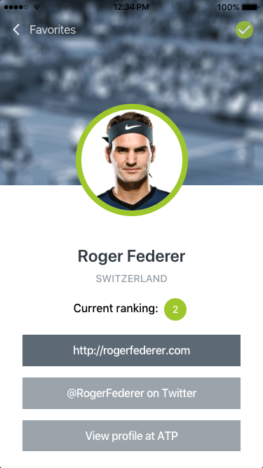
The original design in this example was done by Sebastian Heit and was posted on Dribble. Before we dive into the code, let’s break down the design into sub-tasks to help focus the effort. First, this design has a transparent header and a full-width image as a header graphic. Next is the avatar image, Roger Federer, that sits in between the header image and the lower section. This is a standard design for many profile screens. Beneath the avatar is some player information and some social media buttons. The sample on Dribble included some tabs, but for my attempt, I will ignore that design element.

To recreate this design I needed to obtain visual elements. The header graphic (in this case a tennis court) and a headshot of Roger Federer. I found a nice profile image of Roger Federer without any trouble. For the header graphic, I searched Flickr for a suitable substitute. I found this image by Zepfanman.com, and it is available to be used by me.

Isner v. Kohlschreiber, Part III

I brought the image into Photoshop to apply the blue tint and the blur effect, giving me this result:

Isner v. Kohlschreiber, Part III

The revised image.

Getting Started

I generated a new Ionic blank template: $ ionic start profile blank –type=angular, then copied the background image and the avatar image into the newly created assets folder in the project directory.

Step 1: Transparent Header

The first styling task that I wanted to take on was to make the header transparent. Since Ionic’s header component supports this style, I just needed to add a translucent attribute to the ion-header tag. By itself, this will only make the header transparent while the ion-content will still be positioned under the header. This means if our content were to scroll, it would not scroll under the header. If that is what your design calls for, you need to add the fullscreen attribute to the ion-content as well and set it to true.

In the HTML template, I added buttons that were in the design; a button with an icon of the Back arrow with a label of Favorites and, a Checkmark button. Since this is not in a real app, the Back Arrow is an actual button in my sample. Typically, this would be an Ionic Back Button component in order to pick up the built-in navigation features.

Another thing to note is the checkmark button. Ionic’s icon library has that icon available. There was one minor issue with it in that the interior checkmark was transparent. This did not match the design, so I took the source SVG file and made a quick edit to change this. I saved this new version of the icon into the assets folder as well. That ion-icon will use the src attribute to point to my icon instead of the name attribute which will use the Ionicon library.

Header Image

The next step in recreating this design was applying that header image I prepared earlier. Switching from the HTML template file to the .scss file, this I can set the –background variable of the ion-content component to point to the background graphic. Positioning is set to be the top and center. As for how the image should be shown in the viewport, I opted for cover and fixed. I also did not want it to be repeated, so I included the no-repeat option.

In the .scss file, I also made sure that the ion-toolbar‘s background was transparent by setting its background variable to transparent.

If you save both files and run $ ionic serve in the command line, you should see the image being applied to the background and also under our transparent header.


<ion-header translucent no-border>
<ion-toolbar>
<ion-buttons slot="start">
<ion-button color="light">
<ion-icon slot="start" name="ios-arrow-back"></ion-icon>
Favorites
</ion-button>
</ion-buttons>
<ion-title>&nbsp;</ion-title>
<ion-buttons slot="end">
<ion-button>
<ion-icon slot="icon-only" src="../../assets/checkmark-filled.svg"></ion-icon>
</ion-button>
</ion-buttons>
</ion-toolbar>
</ion-header>
<ion-content fullscreen="true" slot="fixed" >
<div class="ion-padding">
The world is your oyster.
<p>If you get lost, the <a target="_blank" rel="noopener" href="https://ionicframework.com/docs/">docs</a&gt; will be your guide.</p>
</div>
</ion-content>

view raw

home.html

hosted with ❤ by GitHub


ion-content {
–background: url(../../assets/background_full.jpg) no-repeat top center/cover fixed, #fff;
position: relative;
height: 100%;
width: 100%;
}
ion-toolbar {
–background: transparent;
}

view raw

home.scss

hosted with ❤ by GitHub

Now to add the avatar image and the player content.

Step 2: Player Avatar

Creating the avatar portion of the design will be done using various divs and applying the correct CSS positioning types. Let’s being by defining the HTML structure. To begin, we will wrap everything in a basic div and give it a CSS class of card. This div will act as our master container for our content. Next, we will add another div that will provide the vertical spacing needed to show the rest of the header image. On that div, we will set the class to header.  Within the header div, another div is added, which will be used to position the avatar image. Here is the full HTML snippet:


<div class="card">
<div class="header">
<div class="avatar">
<img src="../../assets/player104.png" alt="">
</div>
</div>
</div>

view raw

home.html

hosted with ❤ by GitHub

Switching to the home.page.scss file, we will add the CSS needed to style and position the avatar. The card class will center the content horizontally by setting the margin value to be 0 and auto. Then set the header class to define the height of the div to be 200 pixels. The avatar class is where the heavy lifting will begin. The width and height of this div will be the desired width of our avatar image. The critical CSS that needs to be applied is setting the position attributes value to relative. For good measure, we will set the margin to be 0 and auto (to ensure centering horizontally). Within the avatar div, the image tag will be defined by setting its source to a nice profile photo of Roger Federer. It is on the image tag that CSS will make our avatar how we want it. First, the display type is changed to block from inline. Next, the border-radius is set to 50% to generate a circle around the image. The border property is set to be 8 pixels, solid and our green (#9DC912). In case the image has transparency, set the background color to white. Otherwise, our header image will be visible inside the avatar. Those properties will get our shape and style correct, but will not solve our positioning needs. To fix that, change the position property to absolute. This will allow us to place the image where we want it. Since its parent’s position is relative, it will be set absolute with respect to its parent and not the page. However, we still need to define what that absolute location is. Here we can leverage the CSS calc function to solve this. While I could have supplied a pre-calculated number, I wanted to demonstrate the math behind the value. The goal of the calculated number is to place the image half-way down its height (including the border). In this case, it is 80 pixels (half the defined avatar width) + 4 pixels (half the border width) times -1, so that image is moved downward.


.card {
margin: 0 auto;
.header {
height: 200px;
.avatar {
width: 160px;
height: 160px;
position: relative;
margin: 0 auto;
img {
display: block;
border-radius: 50%;
position: absolute;
bottom: calc(-1*(80px + 4px));
border: 8px solid #9Dc912;
background-color: #fff;
}
}
}
}

view raw

home.scss

hosted with ❤ by GitHub

Here is what the screen should look like at this point:

avatar-1

Since there is no additional content yet, the avatar will be ‘floating’ over our background.

Step 3: Player Information

With our avatar in place, we can turn our attention to the player information portion of the design. This portion is mostly a collection of traditional HTML tags, along with the ion-chip component and the ion-button component.


<div class="card-body">
<div class="user-meta ion-text-center">
<h3 class="playername">Roger Federer</h3>
<h5 class="country">Switzerland</h5>
<h6 class="ranking">Current ranking: <ion-chip>
<ion-label>2</ion-label>
</ion-chip>
</h6>
</div>
<ion-button expand="full" color="primary">http://rogerfederer.com</ion-button&gt;
<ion-button expand="full" color="secondary">@RogerFederer on Twitter</ion-button>
<ion-button expand="full" color="secondary">View profile at ATP</ion-button>
</div>

view raw

home.html

hosted with ❤ by GitHub

The CSS for the card-body is where we need to set two things; the background color (white) and the height. If we don’t set a height value, this div might not fill the screen. To solve this, the CSS calc function will come to rescue again. This time we will take the full height (100vh) and subtract the header height we defined (200 pixels), as well as the toolbar’s height (56 pixels). We will also adjust the spacing, font size, weight, and color of some of the other elements as well.


.card-body {
background-color: #ffffff;
padding: 30px;
height: calc(100vh – (200px + 56px));
overflow: hidden;
.user-meta {
padding-top: 40px;
.playername {
font-size: 24px;
font-weight: 600;
color: #303940;
}
.country {
font-size: 90%;
color: #949ea6;
text-transform: uppercase;
margin: 0 auto;
}
}
}

view raw

home.scss

hosted with ❤ by GitHub

For styling the ion-chip, we just need to set the –background variable to #9DC912 and the –color variable to #fff.

The final touch is to set the overall CSS variables to align with our design. Using the Ionic Color Generator I altered the color set. Here are the changed color values:

  --ion-color-primary: #5c6a76;
  --ion-color-primary-rgb: 92,106,118;
  --ion-color-primary-contrast: #ffffff;
  --ion-color-primary-contrast-rgb: 255,255,255;
  --ion-color-primary-shade: #515d68;
  --ion-color-primary-tint: #6c7984;

  --ion-color-secondary: #9ba4ac;
  --ion-color-secondary-rgb: 155,164,172;
  --ion-color-secondary-contrast: #ffffff;
  --ion-color-secondary-contrast-rgb: 255,255,255;
  --ion-color-secondary-shade: #889097;
  --ion-color-secondary-tint: #a5adb4;

  --ion-color-tertiary: #303940;
  --ion-color-tertiary-rgb: 48,57,64;
  --ion-color-tertiary-contrast: #ffffff;
  --ion-color-tertiary-contrast-rgb: 255,255,255;
  --ion-color-tertiary-shade: #2a3238;
  --ion-color-tertiary-tint: #454d53;

  --ion-color-success: #9dc912;
  --ion-color-success-rgb: 157,201,18;
  --ion-color-success-contrast: #ffffff;
  --ion-color-success-contrast-rgb: 255,255,255;
  --ion-color-success-shade: #8ab110;
  --ion-color-success-tint: #a7ce2a;

If you have not worked with adjusting the global variables, these are defined in the variables.scss file. With that, we have recreated the profile screen!

profile-2.png

The full source can be found at: https://github.com/chrisgriffith/ionic-profile-design Feel free to ping me with questions or other design challenges in Ionic.


Dynamic Ionic Theming

With the shift to CSS variables for much of the styling of the Ionic components, a popular question on the Ionic forums is “How do I dynamically change the look my application at runtime?” For example, wanting a light or dark theme, or have the controls match the logo colors of your favorite sports team. In this post, I am going to show you the basics for doing this. To begin, generate a new Ionic application:

$ ionic start themedemo blank --type=angular

Once it is finished generating, open the home.html. Let’s replace the template code with the following:


<ion-header>
 <ion-toolbar>
   <ion-buttons slot="secondary">
     <ion-button fill="outline">
       <ion-icon slot="start" name="star"></ion-icon>
       Star
     </ion-button>
   </ion-buttons>
   <ion-title>Theme Demo</ion-title>
   <ion-buttons slot="primary">
     <ion-button color="danger" fill="outline">
       Edit
       <ion-icon slot="end" name="create"></ion-icon>
     </ion-button>
   </ion-buttons>
 </ion-toolbar>
</ion-header>
<ion-content>
 <ion-button (click)="colorIt()">Color Theme</ion-button>
 <ion-button (click)="setTheme('dark')">Dark Theme</ion-button>
 <ion-button (click)="setTheme('light')">Light Theme</ion-button>
</ion-content>

view raw

home.page.html

hosted with ❤ by GitHub

This new template has some elements in the ion-header and three buttons that will we can use to alter the applied CSS variables.

Let’s set up the CSS variables that we will be interacting with, open the variables.scss file that is located in the theme directory. If you have not worked with this file before, this is where all the default Ionic theme colors are defined; primary, secondary, etc. In the :root declaration, we are going to add two new variables that we will be changing via our code. Add a –mycolor variable and set its value to rebeccapurple, and another variable –mytextcolor and define its value as #fff. Your variables.scss file should look like this at the start:


:root {
 –mycolor: rebeccapurple;
 –mytextcolor: #fff;
 /** primary **/
 –ion-color-primary: #3880ff;
 –ion-color-primary-rgb: 56, 128, 255;
 –ion-color-primary-contrast: #ffffff;
 –ion-color-primary-contrast-rgb: 255, 255, 255;
 –ion-color-primary-shade: #3171e0;
 –ion-color-primary-tint: #4c8dff;
 …more…
}

view raw

home.page.scss

hosted with ❤ by GitHub

With our two variables now defined, we can now apply them. Open the global.scss file. This file is the proper place for setting any global CSS to our application. In this simple example, we are just going to change the background color and the text color of our Ionic toolbar. By checking the Ionic documentation on that component, there are two defined CSS variables for those properties; –background and –color respectively. If we just want to override the values, we could set them directly like this:


ion-toolbar {
   –background: rebeccapurple;
   –color: #ffffff;
}

view raw

global.scss

hosted with ❤ by GitHub

Unfortunately, we can not directly assign a CSS variable to another in this fashion. Instead, we need to declare it as a var before we can set the value of the property. To do this, we change our CSS to use the var function (https://developer.mozilla.org/en-US/docs/Web/CSS/var):


ion-toolbar {
   –background: var(–mycolor);
   –color: var(–mytextcolor);
}

view raw

global.scss

hosted with ❤ by GitHub

If you saved all the files and ran $ ionic serve, you should see your header’s toolbar in a nice purple and the text in white. Since there are no methods for those buttons to call they won’t function (and odds are your editor might be warning you about that fact).

Switching to the home.page.ts file, let’s add those methods. After the class definition, add an object that will define our theme colors. For more robust theming I would suggest creating a service or module that contains your theme management, but this example we will not add that level of complexity. Here is our new variable:

theme = {
  mycolor: 'rebeccapurple',
  mytextcolor: '#fff'
};

Currently, the Blank template’s component does not include a constructor, so let’s add a basic one:

constructor() { }

For the colorIt method, I want to show you how to set the property directly. This option works well if you are setting a small number of variables. To do this we will call document.documentElement.style.setProperty() method. This method has three parameters: the property name, the value (optional), and the priority (optional). Since we are interacting with CSS variables, we can not set the property name as –mycolor. Instead, we need to wrap the CSS variable with a ` or backtick. The new value that we want to set can be wrapped with the standard single quote. Here is what the code should look like:

colorIt() {
  document.documentElement.style.setProperty(`--mycolor`, '#ccc');
  document.documentElement.style.setProperty(`--mytextcolor`, '#000');
}

 Those two lines will change the CSS variables to their new values, and trigger a repaint of the screen.

But what if swapping themes requires changing more than just a few variables? Let me show you the foundation for solving that challenge. Two of the buttons in our template called the setTheme method, each passing in a string that was a theme name (light or dark). This method will update the theme object we defined in our class with new values. But the workhorse of the method is actually the forEach loop that we will call. This will walk through each of the properties names and set their values. Here is the full code:

setTheme(userTheme: string) {
  if (userTheme === 'dark') {
    this.theme.mycolor = 'rebeccapurple';
    this.theme.mytextcolor = '#fff';
  } else {
    this.theme.mycolor = '#ccc';
    this.theme.mytextcolor = '#000';
  }

  Object.keys(this.theme).forEach(k =>
    document.documentElement.style.setProperty(`--${k}`, this.theme[k])
  );
}

If you have not seen the ${} before, this is ES6’s template notation. If you run the application now you should be able to toggle the header bar color and text color. 

theme_sample

So, there are the basics for having dynamic themes in Ionic 4. Like I mentioned, you are probably going to want to expand upon this to have a proper service or module to manage your theming across your application. Feel free to ping me with questions or other design challenges in Ionic.

Ionic Design: Using the Grid Component

One of the things that catch my eye when I am scanning the Ionic Forums is design related questions. Sometimes these are questions around styling a component, but sometimes the poster asked for a more complex design solution. I save these, and when my schedule allows, I will tackle them. This design challenge was someone looking for a solution in the layout of a card. Here is my Adobe XD clone of the initial request (I have opted not to share the initial query).

CANVAS

As you can see there is an avatar, user name, game stats, and an action button.

CANVAS2

Now I suspect the avatar might have led the poster to look at using the Ionic avatar component and in turn, the Ionic List component. Instead, I opted to leverage the Ionic Grid to solve this layout. Although there are four regions, I opted to consider this design to use two regions; one for the request button and one for the rest. While one might have chosen three regions, I wanted to make sure that the avatar was connected to the user name and game stats. By placing the user name and game stats in their own cell, it could shift positioning.

Let’s place our initial content within two columns in the Ionic grid inside an Ionic Card component:


<ion-card>
<ion-card-content>
<ion-grid>
<ion-row>
<ion-col>
<img src="../../assets/avatar.png">
<h1>Chris Griffith</h1>
<p>6W 3D 2L</p>
</ion-col>
<ion-col>
<ion-button>Register Result</ion-button>
</ion-col>
</ion-row>
</ion-grid>
</ion-card-content>
</ion-card>

view raw

home.html

hosted with ❤ by GitHub

We will focus on the text styling first. We will place the user name inside an h1 tag and add a CSS class of userName.


<h1 class="userName>Chris Griffith</h1>

view raw

home.html

hosted with ❤ by GitHub

In our scss file we will set the following properties:


.userName {
font-size: 16px;
font-weight: bold;
color: #5D5F65;
}

view raw

home.scss

hosted with ❤ by GitHub

For the game stats, we will place it in a paragraph tag. For each stat, we will wrap in a span tag and assign each a specific CSS class for wins, draws, and losses. By doing this we can leverage the border property to create the colored bar under each stat.


<p class="gameStats>
<span class="wins">6W</span><span class="draws">3D</span><span class="losses">2L</span>
</p>

view raw

home.html

hosted with ❤ by GitHub

Here is the CSS for this:


.gameStats {
margin-top: .5em;
font-size: 13px;
font-weight: bold;
color: #BBBCBE;
}
.wins {
border-bottom: 6px solid #62f254;
margin-right: .5em;
}
.draws {
border-bottom: 6px solid #edce59;
margin-right: .5em;
}
.losses {
border-bottom: 6px solid #d04749;
margin-right: .5em;
}

view raw

home.scss

hosted with ❤ by GitHub

Turning to the avatar, we can apply the border-radius property and also enforce a maximum width. We will address positioning in a bit.


<img class="avatar" src="../../assets/avatar.png" />

view raw

home.html

hosted with ❤ by GitHub


.avatar {
border-radius: 10px;
max-width: 45px;
}

view raw

home.scss

hosted with ❤ by GitHub

Our final element to be styled is the call to action button. This element will be the Ionic button component.


<ion-button>Register Result</ion-button>

view raw

home.html

hosted with ❤ by GitHub

The Ionic button will adapt to each platform, which requires overriding some of those settings, notably the border radius and the text case. For the latter, we can set the CSS variable for border-radius and the background color.


ion-button {
–border-radius: 10px;
–background: #6765F7;
}

view raw

home.scss

hosted with ❤ by GitHub

The button’s text case is not one of the listed variables. Instead, we can use of one the Ionic’s CSS utilities. For Ionic, many of these CSS styling helpers were CSS attribute selectors. But with Ionic expanding to other frameworks, these helpers have become namespaces CSS classes. So we can apply the ionic-text-uppercase case to our button.


<ion-button class="ion-text-uppercase">Register Result</ion-button>

view raw

home.html

hosted with ❤ by GitHub

That covers the basic visual styling, so let’s tackle our positioning. The Ionic grid is built upon the CSS Flexbox. Flexbox is a powerful layout solution for layout in one direction.

Since we want our content to be vertically centered, we can use the align-items-center value for a flexbox. For the Ionic grid, we declare this on the ion row by applying it via a CSS class.


<ion-row class="ion-align-items-center”>

view raw

home.html

hosted with ❤ by GitHub

Next, we need to define the positioning of our two ‘cells’. For this, we can use Flexbox’s justify-content-between to position them against either side. Again, this is done by adding in a CSS class.


<ion-row class="ion-align-items-center ion-justify-content-between">

view raw

home.html

hosted with ❤ by GitHub

Let’s deal with our avatar and the text. The solution I opted to use was to turn the image into a block level element and float it to the left. We will add some margin to the right side to bump the text over. The game stats could also use some spacing between them and the user name so we can add some margin to that paragraph tag.


.avatar {
border-radius: 10px;
max-width: 45px;
display: block;
float: left;
margin-right: 1rem;
}

view raw

home.scss

hosted with ❤ by GitHub

The button also needs some layout attention as it is currently aligned to the left of the container. What we would like is for the button to be anchored to the right edge of the container. To solve this we can apply another Ionic CSS utility class — the ion-float-right class.


<ion-button size="small" class="ion-float-right ion-text-uppercase">Register Result</ion-button>

view raw

home.html

hosted with ❤ by GitHub

The final touch is to reduce the inner spacing of our containing Ionic card component. If you scan the Ionic documentation, you will not find a CSS variable to adjust this. But fear not! Pulling up Dev tools in our browser we can see that that spacing is applied directly, meaning we can override it without difficulty.


.card-content-md {
padding-inline-start: 0;
padding-inline-end: 0;
}
.card-content-ios {
-webkit-padding-start: 0 !important;
padding-inline-start: 0 !important;
-webkit-padding-end: 0 !important;
padding-inline-end: 0 !important;
}

view raw

home.scss

hosted with ❤ by GitHub

Here is the final output running on my iOS emulator.

ios

I think the design is fairly close to what I was using a reference. To learn more about Ionic CSS Utilities, see their documentation. For more information about the Ionic grid, I suggest you read over this section in the documentation.

If you found this design exercise useful or have questions let me know.

Icons and Floating Inputs: Ionic

I was skimming the Ionic Worldwide Slack channel and saw this post:

Hi all,
i stuck on mixing an `ion-icon` with an `floating label` like in this the *Angular Material Bootstrap Inputs Demo* (https://mdbootstrap.com/angular/components/#).

I tried this:

< ion-item>
< ion-icon slot="start" name="bulb" color="ownred">< /ion-icon>
< ion-label position="floating">name< /ion-label>
< ion-input type="text" [(ngModel)]="newItem.name">< /ion-input>
< /ion-item>


But this will center the icon and not align it on bottom, like in the shown picture.

Screen Shot 2018-10-27 at 10.28.41 AM

Do you have any idea?

This got me thinking how to create this. My work machine was being updated to Mojave, so I had a few moments to play around with a solution.

The one I came up with was to break the problem into two parts. I figured that I needed to isolate the icon from the label and input set, so I turned to the ion-grid component to handle that. By using the align properties of Flexbox, I could position the elements how I needed.


<ion-header>
<ion-toolbar>
<ion-title>
Ionic Blank
</ion-title>
</ion-toolbar>
</ion-header>
<ion-content padding>
<ion-grid>
<ion-row align-items-end>
<ion-col size="1" align-self-bottom>
<ion-icon name="mail" size="large" [ngClass]="{'activeInputIcon': isLabelActive}"></ion-icon>
</ion-col>
<ion-col>
<ion-item>
<ion-label position="floating">Floating Label</ion-label>
<ion-input (ionBlur)="toggleIcon($event)" (ionFocus)="toggleIcon($event)"></ion-input>
</ion-item>
</ion-col>
</ion-row>
</ion-grid>
</ion-content>

view raw

home.page.html

hosted with ❤ by GitHub

In playing with the reference that was supplied, When the input received focus, the icon also changed color. To make that action happen, I add to event handlers on the input for the ionBlur and ionFocus events.


import { Component } from '@angular/core';
@Component({
selector: 'app-home',
templateUrl: 'home.page.html',
styleUrls: ['home.page.scss'],
})
export class HomePage {
isLabelActive: Boolean = false;
constructor () { }
toggleIcon(evt) {
this.isLabelActive = !this.isLabelActive;
}
}

view raw

home.page.ts

hosted with ❤ by GitHub

The handler for those events simply toggles a boolean. I use that variable’s state to trigger the CSS class state using [ngClass]={‘activeInputIcon’: isLabelActive}” on the ion-icon. So, when the isLabelActive is true, the activeInputIcon class is applied.


.activeInputIcon {
color:#3880ff;
}

view raw

home.page.scss

hosted with ❤ by GitHub

With that, we have rebuilt a sample of the combined icon and floating label input.

demo

Now, this sample is very basic. It does not handle multiple inputs so you will need to create a solution to solve that problem. For a bigger challenge, this entire element could be wrapped into a custom component…but I will leave that up to someone else.

Case Study: Stone Fest 21 – PWA

Living in San Diego, we are surrounded by over 140 craft breweries. Once a year, Stone Brewing hosts an annual celebration, where they invite a bunch of their brewery friends to town and showcase their brews. I have been attending for a number of years, and one of the challenges in attending was having to find the beer on Untappd and check-in. So this year I thought I would whip up a quick Progressive Web App (PWA), that would allow me to quickly locate my beer and check in. Here is a link to the working Stone Fest 21 app.

After assembling the data set of the breweries, the beers, their logos (thanks, Untappd!), I generated the actual Ionic application. Since my buddies were on both iOS and Android, I knew the web was my only publishing option. But before I uploaded the code from Ionic to my server, there were some additional steps required to improve the performance of the PWA. Here is a list of the changes I made to project:

Enable gzip

By default, my Dreamhost account that I hosted Stone Fest 21 on did not have this enabled. So, I had to create a .htaccess file and enable it on the server.

# BEGIN GZIP
< ifmodule mod_deflate.c>
AddOutputFilterByType DEFLATE text/text text/html text/plain text/xml text/css application/x-javascript application/javascript
< /ifmodule>
# END GZIP

Improving iOS support

Since PWA support on iOS is not on par with Android was to include some Apple specific meta tags in the head of the index.html file:

< meta name="apple-mobile-web-app-capable" content="yes">
< meta name="apple-mobile-web-app-status-bar-style" content="black">
< meta name="apple-mobile-web-app-title" content="Stone Fest 21">

For more on these tags, see the Apple documentation.

App Icons

Although the manifest.json defines our app icon, not all platform understand this. So as a backup, I add this snippet in the index.html file to assist with that issue:

< link rel="apple-touch-icon" sizes="57x57" href="apple-icon-57x57.png">
< link rel="apple-touch-icon" sizes="60x60" href="apple-icon-60x60.png">
< link rel="apple-touch-icon" sizes="72x72" href="apple-icon-72x72.png">
< link rel="apple-touch-icon" sizes="76x76" href="apple-icon-76x76.png">
< link rel="apple-touch-icon" sizes="114x114" href="apple-icon-114x114.png">
< link rel="apple-touch-icon" sizes="120x120" href="apple-icon-120x120.png">
< link rel="apple-touch-icon" sizes="144x144" href="apple-icon-144x144.png">
< link rel="apple-touch-icon" sizes="152x152" href="apple-icon-152x152.png">
< link rel="apple-touch-icon" sizes="180x180" href="apple-icon-180x180.png">

I used the $ ionic cordova resources command to generate them, then renamed the manually. Since the $ ionic build command will wipe out the www directory, I added them directly to the server.

Updating the BODY tag

One of the items that the Lighthouse test measures is “First Meaningful Paint”. For those who don’t know this term, First Meaningful Paint is the time when page’s primary content appeared on the screen. I added inline CSS to the body tag, so that the browser would render something while the app was starting.

< body style="background-color: #1c1b17; background-image: url('assets/imgs/logo.jpg'); background-position: center; background-repeat: no-repeat;">

Handling the no JavaScript case

Lighthouse also checks what you do if JavaScript was disabled by the user. Remember, this is a Progressive web app. In my case, there was not a lot you can do without JavaScript, but I included this tag to meet the requirement:

< noscript>
< h1>Stone Fest 21 requires JavaScript< /h1>
< /noscript>

Removing Cordova

When you generate an Ionic application, Cordova plugins are automatically integrated, specifically the Splash Screen and Status Bar plugins. Since we are deploying to the web, we can remove Cordova and these plugins from our project. Using $ npm uninstall @ionic-native/splash-screen and $ npm uninstall @ionic-native/status-bar

Edit the app.module.ts to remove the import statements for these two plugins and remove them from the providers array.

In the app.component.ts file also remove the imports. Also, you will remove the injected imports from the arguments in the constructor, as well as the two references to the plugins in the platform.ready check.

If you generated your Ionic application with Cordova integration, there are other plugins and modules that you should remove as well. If you open your package.json file you will several references to cordova-* items. Go ahead and use npm to uninstall them:

  • cordova-plugin-console
  • cordova-plugin-device
  • cordova-plugin-splashscreen
  • cordova-plugin-statusbar
  • cordova-plugin-whitelist
  • and ionic-plugin-keyboard

Depending on what platforms you may have installed, you might also have these modules:

  • cordova-ios
  • cordova-android

Remove them as well.

Finally, we can also remove @ionic-native/core, as we have now scrubbed our Ionic application of any Ionic Native code.

Image Paths

As I checked my Lighthouse score, I noticed that it was flagging how my brewery logos were being called, as well as an accessibility issue around them. To quickly solve this, I adjusted the img tag to reference the full path to the logo and added the alt attribute

< img src="https://aj-software.com/apps/stone/assets/breweries/{{brewery.logo}}" alt="Company Logo">

Enabling the Serviceworker.js code

By default, this code block is commented out in the index.html. Uncomment this block of code and you have a nicely configured service worker ready to go.

if ('serviceWorker' in navigator) {
 navigator.serviceWorker.register('service-worker.js')
 .then(() => console.log('service worker installed'))
 .catch(err => console.error('Error', err));
}

Updating the manifest.json file

The last tweak is updating some of the items in the default manifest.json file.

  1. Update the name and short name. Note: the short name should not be more than 12 characters in length.
  2. Ensure there is an icon available in the proper directory and of the proper size.
  3. Update the theme and background colors to something that matched our app.
  4. Add an orientation value of portrait
{
 "name": "Stone Fest 21",
 "short_name": "Stone Fest",
 "start_url": "index.html",
 "display": "standalone",
 "icons": [{
 "src": "assets/imgs/logo.jpg",
 "sizes": "512x512",
 "type": "image/jpg"
 }],
 "background_color": "#1c1b17",
 "theme_color": "#1c1b17",
 "orientation": "portrait"
}

Summary

After implementing these steps, the Stone Fest 21 app received  the following Lighthouse score:

pwa_score

Hopefully, these guidelines can help you create better PWA using Ionic. Until stencil.js is ready, this is about a good as I can make an Ionic-Angular’s performance. I will be porting this application to stencil shortly and will update this post with the results. The source code is available on my GitHub account.

Customizing Ionic Native Mocks

By design, the Ionic Native Mocks I wrote are very generic. They just return the bare minimum amount of data for them to function. But for them to be more useful in your project, you probably will want to customize them. In this blog post, I will show you how to do this. For this example, we will customize the BarcodeScanner mock, in part, as it is was the plugin that inspired the project.

In your existing Ionic project, first import the actual Ionic native module:

$ npm install --save @ionic-native/barcode-scanner

And the actual Cordova plugin as well,

$ ionic cordova plugin add phonegap-plugin-barcodescanner

Before we update the app.module.ts file, let’s install the mock first. Although the mocks are available via npm, we want to get the code directly from GitHub and the source typescript code (https://github.com/chrisgriffith/ionic-native-mocks/tree/master/src/%40ionic-native-mocks/plugins/barcode-scanner).

In your project, create a new directory named mocks, and create another directory named barcodescanner. Within that directory, download the index.ts file from Github into this directory.

Now let’s adjust out app.module.ts file. Like all Ionic Native modules, we need to import it.

import { BarcodeScanner } from '@ionic-native/barcode-scanner';

Also import our plugin mock as well.

import { BarcodeScannerMock } from '../mocks/barcodescanner';

Instead of including the Ionic Native plugin directly into the providers array, we instead tell Angular to provide a mapping to our mock. This allows us to keep the rest of application referencing the real Ionic Native module, yet use the code from the mock instead.

{ provide: BarcodeScanner, useClass: BarcodeScannerMock }

At this point we could build our app, making calls to the barcode scanner plugin without needing to install on an actual device. But, out of the box, the barcode scanner is going to return an empty string.

But, let’s have it return something that we might want our user to scan. For my original app, it was a QR code on our packaging. Open the index.ts file within our project and change the scan function to

scan(options?: BarcodeScannerOptions): Promise {

  let code='Your Custom Response Here';

  let theResult:BarcodeScanResult= {format:'QR_CODE', cancelled:false, text:code };

  return new Promise((resolve, reject) => {

    resolve(theResult);

  });

}

Save the file, and run the application. Now when you call the barcode scanner, it will return your custom data.

When you are ready to use the real plugin, change the provider and remove the import of the mock. And there you have a basic guide to customizing your Ionic Native Mocks.

Vertical Tabs in Ionic

Recently I started thinking about designing some Ionic applications specifically for larger physical screens (tablets and desktop). I wanted to have a layout much like Slack or Flickr for my iPad.

IMG_1364

The basics of this layout are to have a fixed series of icons (tabs) displayed vertically on the left side of the window, and the rest of the window displays that tab’s content. However, currently, the Ionic Tab component can only be positioned horizontally at the top or bottom of the window. To solve this I turned to the SplitPane component.

This component allows me to have two separate containers (a sidemenu container and the main content container) that I can adjust and populate with content. However, the sidemenu will typically respond to various screen widths. Since I want the element to always be visible regardless of the width, I just needed to include the ‘when’ attribute to the ion-split-pane component and set its value to ‘xs’. See the documentation for the other allowable values.

By default, the width of the sidemenu is between 270px and 28% of the window. Since I just wanted a single row of touchable icons, I need to override this. When I first began playing with this component, those values were not directly exposed, but after filing a GitHub issue, they are now available as Sass variables.

In the variables.scss file, is simply add the following variables:

$split-pane-ios-side-min-width: 70px;
$split-pane-ios-side-max-width: 70px;
$split-pane-md-side-min-width: 70px;
$split-pane-md-side-max-width: 70px;

Adding my Tabs

With the container ready, I could move on to the next step, creating the tabs themselves. Each tab was going to be a simple button component like this:
< button ion-button large block clear icon-only>
  < ion-icon name="md-list">
</ button>

I repeat this for the other tabs I wanted to display. Since I was not using the Tab component, the state management was going to become my responsibility. To handle the visual feedback, I add the following code to each button:

[color]="isList ? 'primary' : 'light'"

This code will set the color of the button based on the boolean state of the variable isList. If it is true, Ionic’s primary color will be used, otherwise, the light color will be applied. I added this to each of the remaining buttons, changing the variable for each button.

The final piece was to add a click handler to each button so I could switch the main content.

(click)="togglePage('List')"
In the app.component.ts file, I added that function. For this demo, it handles the state swapping and basic page navigation:
togglePage(whichPage: string): void {
  this.isList=false;
  this.isLocation=false;
  this.isSelf=false;
  this.isNotifications=false;
  this.isSearch=false;
  this.isCamera=false;

  letnewTab:string='';

  switch (whichPage) {
    case'List':
      this.isList=true;
      newTab='PhotosPage';
      break;
    case'Location':
      this.isLocation=true;
      newTab='LocationsPage';
      break;
    case'Self':
      this.isSelf=true;
      newTab='SelfPage';
      break;
    case'Notifications':
      this.isNotifications=true;
      newTab='NotificationsPage';
      break;
    case'Search':
      this.isSearch=true;
      newTab='SearchPage';
      break;
    case'Camera':
      this.isCamera=true;
      newTab='CameraPage';
      break;
   }

   this.nav.setRoot(newTab);
}
Note: You do need to include the @ViewChild into your component and the proper imports as well.
Now, I have a basic working tab system!

Centering the Tabs

I decided to challenge myself a little further and wanted to have the tabs be vertically centered. Since we can safely use Flexbox, this is actually straight forward.
Rather than adjusting an Ionic tag directly (and possibly some unknown cascade), I wrapped my buttons in a new div and gave it a class of ‘centervert’. The CSS is:
.centervert {
  height: 100%;
  display: flex;
  flex-direction: column;
  justify-content: center;
}
The trick to making this work is to set the height of the div to be 100%. This tells the webview how to calculate the proper positioning.  Here is what the app looks like:
VertialTabsIonic

Vertical ‘Tabs’

I did add a Footer component to have App settings and Log Out button be anchored to the bottom of the column. The content pages are just Ionic generated stubs. I have posted the source for the shell of the application on my GitHub repo. Have fun!

Ionic Split Pane – Part 2

In this post, I am going to dig a little deeper into working with the new Ionic Split Pane component. I explored it some in this post. There are three elements I want to explore: a full header design, understanding how to navigate pages, and handling resizing.

Full Header Design

Several readers asked about how you might achieve this design:

full_header

A full header Ionic Split Pane

After playing around with different variations of the component structure and encountering some navigation troubles, I settled on using a basic CSS approach to this design.

The app.html is a standard component (sorry spacing with the brackets, blame WordPress):


<ion-split-pane>
<ion-menu [content]="content">
<ion-header>
<ion-toolbar>
<ion-title>{{title}}</ion-title>
</ion-toolbar>
</ion-header>
<ion-content>
<ion-list>
<ion-item detail-push *ngFor="let project of projects" (click)="projectSelected(project)">
{{ project.name }}
</ion-item>
</ion-list>
</ion-content>
</ion-menu>
<!– main navigation –>
<ion-nav [root]="rootPage" #content swipeBackEnabled="false" main></ion-nav>
</ion-split-pane>

view raw

app.html

hosted with ❤ by GitHub

This should look very close the documentation from Ionic. All we need to do is update the app.scss file with two changes:


.split-pane-visible > .split-pane-side {
border-right: none !important;
}
.menu-inner ion-content {
border-right: 1px solid #dedede;
}

view raw

app.scss

hosted with ❤ by GitHub

The first change removes the line that divides the two headers. This line actually runs down the entire right side of the pane. So, with the second change, we restore the line back to the default style of a solid 1-pixel line of medium gray.
We still have two headers, but by not including any visible text in the main header, we initially have the illusion of a single header.

Handling Resizing

Here is where I encountered one of my first issues. The design worked fine in desktop sizes, but when I reduced the width below its breakpoint, my pane would disappear and along with it, my title.
The component has an event listener for when a pane state change is triggered. So, I changed my < ion-split-pane > tag to include (ionChange)=”updateTitles()”.
Now, I just needed to manage what the visible state of the pane is, and the broadcast this state to my other pages, so they could replace the empty title with my pane’s title.
Here is my app.componet.ts code:


import { Component, ViewChild } from '@angular/core';
import { Events, MenuController, Nav, Platform } from 'ionic-angular';
import { StatusBar, Splashscreen } from 'ionic-native';
import { MainPage } from '../pages/main/main';
import { MercuryPage } from '../pages/mercury/mercury';
import { GeminiPage } from '../pages/gemini/gemini';
import { ApolloPage } from '../pages/apollo/apollo';
import { AstpPage } from '../pages/astp/astp';
import { SkylabPage } from '../pages/skylab/skylab';
import { ShuttlePage } from '../pages/shuttle/shuttle';
import { OrionPage } from '../pages/orion/orion';
@Component({
templateUrl: 'app.html'
})
export class MyApp {
@ViewChild(Nav) nav: Nav;
rootPage: any;
projects: Array<any> = [];
title: String = 'Projects';
menuToggleState: Boolean = false;
constructor(public menuCtrl: MenuController, public platform: Platform, public events: Events) {
this.rootPage = MainPage;
this.projects = [
{ name: 'Mercury', details: MercuryPage },
{ name: 'Gemini', details: GeminiPage },
{ name: 'Apollo', details: ApolloPage },
{ name: 'Skylab', details: SkylabPage },
{ name: 'ASTP', details: AstpPage },
{ name: 'Space Shuttle', details: ShuttlePage },
{ name: 'Orion', details: OrionPage }
]
platform.ready().then(() => {
// Okay, so the platform is ready and our plugins are available.
// Here you can do any higher level native things you might need.
StatusBar.styleDefault();
Splashscreen.hide();
this.platform.width() < 768 ? this.menuToggleState = true : this.menuToggleState = false;
});
}
projectSelected(theProject) {
this.nav.setRoot(theProject.details);
this.menuCtrl.close();
}
updateTitles() {
this.platform.width() < 768 ? this.menuToggleState = true : this.menuToggleState = false;
this.events.publish('title:updated', { menuState: this.menuToggleState });
}
}

We define a menuToggleState boolean to hold our pane’s visible state. This variable is set once the platform is ready. We have hard code the breakpoint to match the split panes. If you change that value, you will need to update it here as well.

The key to this solution is using the Ionic Events module to broadcast this value upon a state change triggered by the IonChange event. When that event occurs, we check the new width, and determine of the pane is now showing or not. Then we publish our custom event throughout our Ionic app.

In each page that is shown with the main content, I adjusted a few items. First, I had the title component is bound the title variable.


< ion-header >
< ion-navbar >
< button ion-button menuToggle >< ion-icon name="menu" >< /ion-icon >< /button >
< ion-title >{{title}}< /ion-title >
< /ion-navbar >
< /ion-header >

view raw

app_header.html

hosted with ❤ by GitHub

When we do not want a title visible, we set this variable to hold a space, rather than an empty string. The reason for this is, without content in the node, Ionic did not properly display any header icons. We also include a button that will auto display our hamburger menu icon when the split pane is hidden, giving us access to that content.

In the component’s code, we need to add the event listener for our custom event we broadcast from the resize action. Here is the full code:


import { Component } from '@angular/core';
import { Events, NavController, NavParams } from 'ionic-angular';
@Component({
selector: 'page-mercury',
templateUrl: 'mercury.html'
})
export class MercuryPage {
title: String = ' ';
constructor(public events: Events, public navCtrl: NavController, public navParams: NavParams) {
events.subscribe('title:updated', (data) => {
if (data.menuState) {
this.title = "Projects";
} else {
this.title = ' ';
}
});
}
}

view raw

mercury.ts

hosted with ❤ by GitHub

This is for the Project Mercury page, each NASA project page has the similar event subscriber included in its constructor. For this sample, I did not rework this into a custom component to properly encapsulate the code as to not need to repeat so much of it across all these pages. The basic structure of the code listens for the event from the master component and depending on the state updates the title variable.

Now when I resize the window smaller than the breakpoint, the title is updated on the main content pages. Here is what it looks like when resized:

panesmall

and the menu being displayed:

pane_sidemenu

Page Navigation

Another tricky part of working with the split pane is understanding how to navigate pages. It was this issue that forced me to abandon several other attempts at a full header design. The heart of updating the main content from the pane is to use the @ViewChild.

Within the class for the app, we define our ViewChild to come from our root NavController using @ViewChild(Nav) nav: Nav;

Now, we can properly reference it in our component, and navigate correctly. Our list of manned NASA projects will call the projectSelected function when clicked and pass along which page to navigate to:


projectSelected(theProject) {
this.nav.setRoot(theProject.details);
this.menuCtrl.close();
}

This function tells the nav that we referenced with the @ViewChild to set it’s rootpage to the project component we stored within our array and that is passed into this function. We also use the MenuController, to automatically close the pane if it is being shown like a normal sidemenu.

Navigation within the Main Content

If you want to have navigation with the main content to a new page, the normal navigation methods work just fine. In the sample, if you click on the NASA meatball logo, it will navigate to a new page showing the NASA worm logo. Clicking the worm logo will return you to the meatball page. However, you can now see the UX issue of having the hamburger menu and the back navigation control. But, the purpose of this exploration with just to get the core functionality working, and not worry about the UX issues. That is left to you and whatever your app’s design might be.
worm
Hopefully, this brief look further into the Split Pane component is useful. The sample code can be found in my GitHub repo. If you are wondering why I picked NASA as my sample, you can visit my other blog, https://spacequest.wordpress.com/ to learn why.

Ionic Split Pane Component – Part 1

Update (March 8, 2017)

Ionic has released version 2.2 of the framework! In addition, to support Angular 2.4.8, the split pane component is now included! Details on this upgrade see the release notes.

Update (February 28, 2017)

The component has been renamed from ion-split-panel to ion-split-pane. I will the GitHub repo soon. Also, note you will need to use this build of Ionic: npm install –save ionic-angular@2.1.0-201702281739
Recently the Ionic team released a preview of the split pane component in this blog post, I want to take a look at it in a bit more depth. For those not familiar with this visual design pattern, it is very similar to the side menu layout. The main difference is that menu usually remains onscreen. Gmail is a great example of this layout pattern. As Ionic begins to expand from the mobile space into progressive web apps and even the desktop, this layout is a common pattern.
Since this component is similar to the side menu layout, let’s scaffold our app using that template.
$ ionic start splitPaneDemo sidemenu --v2
Once the project is ready, go ahead and change the working directory to splitPaneDemo. Since the component is still under development, we need to swap out the release version of Ionic for the nightly build.
$ npm install --save ionic-angular
With our copy of Ionic replaced, go ahead and open app.html. There are just a few things we need to do to convert our side menu template to use the split pane layout.
< ion-split-pane >
  < ion-menu [content]="content" when="xs" >
    < ion-header >
      < ion-toolbar >
        < ion-title >Menu< /ion-title >
      < /ion-toolbar >
    < /ion-header >

    < ion-content >
      < ion-list >
        < button menuClose ion-item *ngFor="let p of pages"    
         (click)="openPage(p)" >
        {{p.title}}
      < /button >
      < /ion-list >
    < /ion-content >

  < /ion-menu >

  < ion-nav main [root]="rootPage" #content swipeBackEnabled="false" >< /ion-nav >
< /ion-split-pane >
We need to tell the component when the ‘menu’ should be displayed. The typical UX flow is to have the split pane hide when the screen or viewport become reduced. The component has the following breakpoints defined:
label min-width
xs 0px
sm 576px
md 768px
lg 992px
xl 1200px
never  –
By passing one of these strings to our when attribute we can control when our menu is shown. Another item to note, the min-width our split pane is 270px and it set to be no larger than 28% of the viewport. All these values are defined within the components SASS files.
< ion-menu [content]="content" when="xs" >
The last adjustment we need to denote the ‘main‘ content for the split pane. For this, just include the main directive to
< ion-nav main [root]="rootPage" #content swipeBackEnabled="false" >
 Running $ ionic serve, will produce this:
screencapture-localhost-8100-1487963384735

The sidemenu template being rendered as a split pane layout.

If you include menuToggle on the header of the main pages, the split pane will understand that directive and use it when the split pane is hidden.
Now, this initial sample is not much more than sidemenu with the expose-aside-when value that was available in v1. Let’s explore a more complex sample.
In this sample, we will enable the split pane to have its own navigation stack that it independent of the main content’s navigation stack. This was a design pattern that I was never able to build using Ionic v1. I had several app ideas that would have been a perfect match for it (yes, I am starting to flesh those apps out now).
First, let’s generate a collection of new pages using the Ionic generate command:
$ ionic g page Main
$ ionic g page SideNav
$ ionic g page SideNav2
$ ionic g page View1
 Next, make sure you update app.module.ts to import these new views. In addition, take note of setting both the root and sideRoot variables, as well as setting myApp within the @NgModule.
import { NgModule, ErrorHandler, Component } from '@angular/core';
import { IonicApp, IonicModule, IonicErrorHandler } from 'ionic-angular';
import { MainPage } from '../pages/main/main';
import { SideNavPage } from '../pages/side-nav/side-nav';
import { SideNav2Page } from '../pages/side-nav2/side-nav2';
import { View1Page } from '../pages/view1/view1';

@Component({
 templateUrl: 'app.html'
})
export class myApp {
 root = MainPage;
 sideRoot = SideNavPage;
}

@NgModule({
 declarations: [
 myApp,
 MainPage,
 SideNavPage,
 SideNav2Page,
 View1Page
 ],
 imports: [
 IonicModule.forRoot(myApp)
 ],
 bootstrap: [IonicApp],
 entryComponents: [
 myApp,
 MainPage,
 SideNavPage,
 SideNav2Page,
 View1Page
 ],
 providers: [{provide: ErrorHandler, useClass: IonicErrorHandler}]
})
export class AppModule {}
Next, let’s adjust the app.html file for our new structure. Instead of directly defining the content of the split pane, we are now just including an element and setting its root property to sideRoot. We will use this reference to populate the content.
< ion-split-pane when="sm" >

  < ion-menu [content]="content" >
    < ion-nav [root]="sideRoot" >< /ion-nav >
  < /ion-menu >

  < ion-nav [root]="root" main #content >< /ion-nav >

< /ion-split-pane >

Since both of these containers had their own navigation stack, we can move through our application independently. Let’s give our various pages some content first so we can see all this in action.

Change side-nav.html to:

< ion-header >

< ion-navbar >
< ion-title >Components< /ion-title >
< /ion-navbar >

< /ion-header >


< ion-content >
< ion-list >
< button menuClose ion-item *ngFor="let p of pages" (click)="displaySubNav(p)" >
{{p.title}}
< /button >
< /ion-list >
< /ion-content >

and side-nav.ts to

import { Component } from '@angular/core';
import { NavController, NavParams } from 'ionic-angular';
import { SideNav2Page } from '../side-nav2/side-nav2';

@Component({
 selector: 'page-side-nav',
 templateUrl: 'side-nav.html'
})

export class SideNavPage {
 pages: Array<{ title: string, component: any }>;

 constructor(public navCtrl: NavController, public navParams: NavParams) {
 this.pages = [
{ title: 'Action Sheets', component: SideNav2Page },
{ title: 'Alerts', component: SideNav2Page },
{ title: 'Badges', component: SideNav2Page },
{ title: 'Buttons', component: SideNav2Page },
{ title: 'Cards', component: SideNav2Page },
{ title: 'Checkbox', component: SideNav2Page },
{ title: 'DateTime', component: SideNav2Page },
{ title: 'FABs', component: SideNav2Page },
{ title: 'Gestures', component: SideNav2Page },
{ title: 'Grid', component: SideNav2Page },
{ title: 'Icons', component: SideNav2Page },
{ title: 'Inputs', component: SideNav2Page },
{ title: 'Lists', component: SideNav2Page },
{ title: 'Loading', component: SideNav2Page },
{ title: 'Menus', component: SideNav2Page },
{ title: 'Modals', component: SideNav2Page },
{ title: 'Navigation', component: SideNav2Page },
{ title: 'Popover', component: SideNav2Page },
{ title: 'Radio', component: SideNav2Page },
{ title: 'Range', component: SideNav2Page },
{ title: 'Searchbar', component: SideNav2Page },
{ title: 'Segment', component: SideNav2Page },
{ title: 'Select', component: SideNav2Page },
{ title: 'Slides', component: SideNav2Page },
{ title: 'Tabs', component: SideNav2Page },
{ title: 'Toast', component: SideNav2Page },
{ title: 'Toggle', component: SideNav2Page },
{ title: 'Toolbar', component: SideNav2Page }
];

}

 displaySubNav(thePage:any) {
  this.navCtrl.push(thePage.component);
 }
}

Next, let’s change the side-nav2.html file to be this:

< ion-header >

 < ion-navbar >
  < ion-title >Details< /ion-title >
 < /ion-navbar >

< /ion-header >

< ion-content >
 < p >New content< /p >
< /ion-content >

We don’t need to change the side-nav2.ts for this simple demo. Let’s change our main.html file this:

< ion-header >

 < ion-navbar >
  < ion-title >Main< /ion-title >
 < /ion-navbar >

< /ion-header >

< ion-content padding >
 < button ion-button primary (click)="goNewView()" >Go View 1< /button >
< /ion-content >

and the main.ts to:

import { Component } from '@angular/core';
import { NavController, NavParams } from 'ionic-angular';
import { View1Page } from '../view1/view1';

@Component({
 selector: 'page-main',
 templateUrl: 'main.html'
})
export class MainPage {

constructor(public navCtrl: NavController, public navParams: NavParams) { }

ionViewDidLoad() {
 console.log('ionViewDidLoad MainPage');
 }

goNewView() {
 this.navCtrl.push(View1Page);
 }
}

Save the files, and try it out.

split-panel-demo

Independent Ionic navigation in the split pane layout.

The source code for this demo is available at my GitHub Repo.