Like many, I am always looking for things that can improve my design and prototyping workflow. When Adobe announced their Design System Package concept, I was very interested. Not having to constantly keep a browser window open to refer to syntax for a component or other design token I might need, sounded very appealing. Having written code-hinters for the Brackets editor in the past, I was more than will to a take a peak under the hood and see how this tool works.
At the heart of it, there is the extension for VS Code, which in turns consumes the design system package (DSP). While you can author a DSP completely within VS Code, it is really meant to be paired with Adobe XD, their prototyping and design tool. While I have been tinkering with the idea of creating a UI kit for the Ionic Framework in XD, that level of effort wasn’t one I was ready to take on yet. Instead, I turned to their icon library, Ionicons. Now, there are about 1,300 icons in that collection, so I was not really looking forward to importing them into XD to then generate the library to then create the DSP. Instead, I saw that the structure of the DSP is really just various folders and some JSON. Given that, I instead wrote a quick node app that would generate the package for me. After a few tweaks, I published the package.
Installation
From the command prompt run `npm install ionic-ionicons-dsp`
Open Adobe XD extension from command palette or via the icon in the lower right of the editor.
The extension should recognize that there is a DSP installed. If not, then choose “Load package”, “select folder”, then “open” from pop-up that finds the ionicons package within your project.
Type “ion”…. enjoy.
If you have any comments or ideas, please let me know chris.griffith at gmail.
With PhoneGap Build shutting down, many developers are now left trying to find options to continue building their Cordova-based applications. While several new services like Ionic’s Appflow and Monaca Cloud have entered the market as replacements. Their cost might be too much for the independent developer. One of the things that attracted many to use PhoneGap Build was it was included as part of your Creative Cloud subscription. There was even a free version for open-source projects. For those developers who are either resource constrained or want complete control over their build system, they should migrate to using the Cordova CLI and building locally.
There are four general steps we need to take to accomplish this:
Install the Cordova CLI
Install the native build environments
Migrate our existing PhoneGap Build App to use Cordova
Build and Test!
Step 1: Installing the Cordova CLI
The Cordova CLI is a free, open source tool that is actively maintained by many of the former PhoneGap team. It runs on Node.js and is available on NPM. You can learn more about it by visiting their site, https://cordova.apache.org/.
To install the Cordova command-line tool, follow these steps:
1. Download and install Node.js [https://nodejs.org/en/download/]. On installation you should be able to invoke node and npm on your command line.
2. Install the Cordova CLI using npm.
On OS X and Linux use the following command:
$ sudo npm install -g cordova
On OS X and Linux, prefixing the npm command with sudo may be necessary to install this development utility in otherwise restricted directories such as /usr/local/share. If you are using the optional nvm/nave tool or have write access to the install directory, you may be able to omit the sudo prefix. There are more tips available on using npm without sudo, if you desire to do that.
On Windows do the following:
C:\>npm install -g cordova
The -g flag above tells npm to install cordova globally. Otherwise it will be installed in the node_modules subdirectory of the current working directory.
To test the installation, simply run
$ cordova
on the command line with no arguments and it should print help text.
One of the major appeals of PhoneGap Build was not having to install the native build tools for each platform. This was especially true for Android, as it required multiple components to be properly installed. PhoneGap Build also allowed Windows users to compile iOS applications without needing a Macintosh.
Now that you are building locally, your will will need access to a Mac with Xcode installed to create your IPA files. Some options to get around this requirement are to use one of the “Mac in the Cloud” services or instead migrate to one of the PhoneGap Build replacements, or consider deploying your application as Progressive Web App.
Rather than rewrite the instructions outlined by the Apache Cordova team, I will point you to the specific instructions for each platform:
The iOS installation is basically just installing Xcode on your Macintosh.
Once this is done, we can validate that status of the tools by running a Cordova command to verify the state of them In the command line run the follow:
$ cordova requirements
You will see a report of the status of the various requirements. If something is not installed, you should go back and reinstall it.
Step 3: Migrate your existing PhoneGap Build App
The method I recommend is to migrate your existing PhoneGap Build app is to first start with a new Cordova application. To create a blank Cordova project using the command-line tool, navigate to the directory where you wish to create your project and run
$ cordova create [ID [NAME ]]
cordova create [ID [NAME [CONFIG]]] [options]
PATH ……………………. Where to create the project
ID ……………………… Reverse-domain-style package name – used in
NAME ……………………. Human readable name
With the basic application skeleton in place, we need to navigate to the project directory that was just created using the change directory, or CD command:
$ cd myapp
From the project directory, you need to add the platforms for which you want to build your app.
The general command is:
$ cordova platform add
To add the iOS platform
$ cordova platform add ios
To add the Android platform
$ cordova platform add android
These can take a bit to install, so be patient. Although you can install any platform, it does not mean you can compile for that platform.
With all the necessary requirements in place, we can perform our first build by running
$ cordova build
The process will take a bit, but it should generate the artifacts we need.
Since SDKs for Android and iOS come bundled with emulators, we can use them without the additional steps required to deploy them onto an actual device. We can target the emulator by running this command:
$ cordova emulate
The app will be built, the proper emulator launched and the app installed. This can take a bit. You may need to refer to the Cordova documentation to make sure you have the native environment setup correctly and the emulator/simulators configured correctly.
Now that we know we can build and emulate a basic Cordova app, we can move on migrating our actual application. With the platforms installed, let’s take a look at the directory structure that was generated:
There are some folders and files that might look familiar, and others that might be new to you. Now we can roll up our sleeves and do the real migration.
In most PhoneGap Build apps, you probably have a single www folder that contains your code, application resources and it’s config.xml file. This is typically the structure that I see:
resources
config.xml
css
img
index.html
js
Go ahead and replace the www folder that was created with the Cordova CLI with the contents of your PhoneGap Build www. Next, we are going to move your resources directory, the one containing your app icons and splash screens and move it to the root directory for the project. The final step will be editing the main config.xml file. By default, the Cordova CLI generates a bare-bones config.xml file, so references to any icons or splash screens are not included.
I recommend following standard directory and file naming structures to reduce possible headaches. In the main config.xml file add the following elements. If you are not targeting that particular platform, feel free to skip it.
This file contains bidirectional Unicode text that may be interpreted or compiled differently than what appears below. To review, open the file in an editor that reveals hidden Unicode characters. Learn more about bidirectional Unicode characters
With the icons and splash screens migrated, we can turn our attention to adding any plugins that our PhoneGap Build application uses. The PhoneGap Build system would read the config.xml and use it to install the plugin into the build system. We need to perform this step ourselves. Open the config.xml file that you moved from your original PhoneGap Build folder. Your plugins will be individually listed in elements. The Cordova CLI command to add a plugin is
$ cordova plugin add
For adding the Statusbar plugin it would be:
$ cordova plugin add cordova-plugin-statusbar
If you need to install a specific version of plugin, append the version number after the plugin name. For example, if I wanted to instal the version 2.0.0 of the camera plugin I would use:
$ cordova plugin add cordova-plugin-camera@2.0.0
The final bit of heavy lifting is migrating all the other modifications you may have made to the original config.xml. These are things like app permissions or security settings. Go through the file and copy them into the new config.xml. If you need additional help with an element, see the Cordova documentation.
Once you have migrated the contents of the older config.xml file into the new one, delete the old config.xml from within the www directory. The same is true with the resources directory. Your www directory should only contain your HTML, CSS and JS files
Go ahead and try running the emulate command again
$cordova emulate
It might take longer than the first time, but once it finishes you should see your application running in the emulator!
Next steps…
Now that you have migrated from PhoneGap Build to use the Cordova CLI, there are some additional steps that will still be needed. PhoneGap Build took care of properly signing your applications for development or release. These are steps that you are now going to have to manage and perform. You can read the documentation about signing your applications on the Cordova website.
Good luck in migrating your apps to whatever build solution you use!
A few days ago, Adobe finally officially announced the end of PhoneGap Build. You can read the announcement on the Adobe I/O blog.
I want to first thank the entire PhoneGap team for everything they have done over the years! PhoneGap Build has been a big part of my professional life for a long time. I gave several workshops on it at Adobe MAX, used it as the foundation for my Intro to Mobile Development course at UCSD, and recorded training for LinkedIn Learning. This simple web service could take my HTML, CSS, and JS and create an app I could run on a phone, bypassing so many headaches of getting a local build to work as almost magical. If you want to see how hard it used to be, try finding some of the original instructions for setting up PhoneGap to work in Xcode.
I knew the end of PhoneGap Build was coming for some time, but could not formally say anything. The PhoneGap team had either left Adobe or was on to new projects. It was only a matter of time before something would break the ‘Build’. I tried to be as clear as I could on the Adobe forums to people, “It was time to move on.”
Now PhoneGap is not truly dead. When Adobe bought Nitobi all those years ago, what they really bought were two things; the PhoneGap name and the Build service. The code that is PhoneGap was given to the Apache Foundation and is alive and well as Cordova. So one option is to transition from building with the PhoneGap Service and begin building locally. I will have a guide for this ready in a few days. Another option is to migrate to one of the maintained services that do the same task. I have long been a user of the Ionic Framework, and they have a service, Appflow, which can fit the bill nicely. I wrote a migration guide for that service which you can read here [].
I will be still hanging out in the PhoneGap forums at Adobe for a while, trying to answer questions where I can. Otherwise, look for me hanging out on the Ionic Forums.
Thanks, PhoneGap, and let’s keep pushing the web forward!
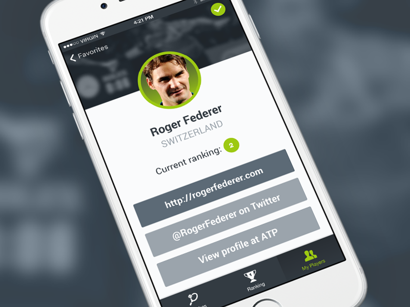
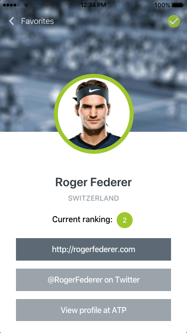
When reviewing questions on the Ionic Forums, I often see questions that are frequently asked. I recently saw a request for help about creating a profile screen, and since I was working on similar features, so the request for help on implementing the design of this profile screen came at a good time.
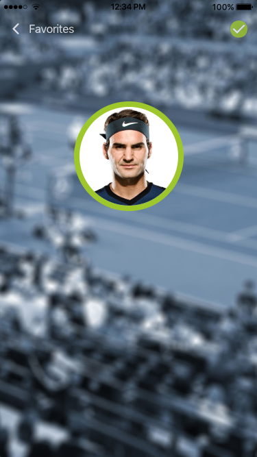
The original design in this example was done by Sebastian Heit and was posted on Dribble. Before we dive into the code, let’s break down the design into sub-tasks to help focus the effort. First, this design has a transparent header and a full-width image as a header graphic. Next is the avatar image, Roger Federer, that sits in between the header image and the lower section. This is a standard design for many profile screens. Beneath the avatar is some player information and some social media buttons. The sample on Dribble included some tabs, but for my attempt, I will ignore that design element.
To recreate this design I needed to obtain visual elements. The header graphic (in this case a tennis court) and a headshot of Roger Federer. I found a nice profile image of Roger Federer without any trouble. For the header graphic, I searched Flickr for a suitable substitute. I found this image by Zepfanman.com, and it is available to be used by me.
I brought the image into Photoshop to apply the blue tint and the blur effect, giving me this result:
The revised image.
Getting Started
I generated a new Ionic blank template: $ ionic start profile blank –type=angular, then copied the background image and the avatar image into the newly created assets folder in the project directory.
Step 1: Transparent Header
The first styling task that I wanted to take on was to make the header transparent. Since Ionic’s header component supports this style, I just needed to add a translucent attribute to the ion-header tag. By itself, this will only make the header transparent while the ion-content will still be positioned under the header. This means if our content were to scroll, it would not scroll under the header. If that is what your design calls for, you need to add the fullscreen attribute to the ion-content as well and set it to true.
In the HTML template, I added buttons that were in the design; a button with an icon of the Back arrow with a label of Favorites and, a Checkmark button. Since this is not in a real app, the Back Arrow is an actual button in my sample. Typically, this would be an Ionic Back Button component in order to pick up the built-in navigation features.
Another thing to note is the checkmark button. Ionic’s icon library has that icon available. There was one minor issue with it in that the interior checkmark was transparent. This did not match the design, so I took the source SVG file and made a quick edit to change this. I saved this new version of the icon into the assets folder as well. That ion-icon will use the src attribute to point to my icon instead of the name attribute which will use the Ionicon library.
Header Image
The next step in recreating this design was applying that header image I prepared earlier. Switching from the HTML template file to the .scss file, this I can set the –background variable of the ion-content component to point to the background graphic. Positioning is set to be the top and center. As for how the image should be shown in the viewport, I opted for cover and fixed. I also did not want it to be repeated, so I included the no-repeat option.
In the .scss file, I also made sure that the ion-toolbar‘s background was transparent by setting its background variable to transparent.
If you save both files and run $ ionic serve in the command line, you should see the image being applied to the background and also under our transparent header.
This file contains bidirectional Unicode text that may be interpreted or compiled differently than what appears below. To review, open the file in an editor that reveals hidden Unicode characters. Learn more about bidirectional Unicode characters
This file contains bidirectional Unicode text that may be interpreted or compiled differently than what appears below. To review, open the file in an editor that reveals hidden Unicode characters. Learn more about bidirectional Unicode characters
Now to add the avatar image and the player content.
Step 2: Player Avatar
Creating the avatar portion of the design will be done using various divs and applying the correct CSS positioning types. Let’s being by defining the HTML structure. To begin, we will wrap everything in a basic div and give it a CSS class of card. This div will act as our master container for our content. Next, we will add another div that will provide the vertical spacing needed to show the rest of the header image. On that div, we will set the class to header. Within the header div, another div is added, which will be used to position the avatar image. Here is the full HTML snippet:
This file contains bidirectional Unicode text that may be interpreted or compiled differently than what appears below. To review, open the file in an editor that reveals hidden Unicode characters. Learn more about bidirectional Unicode characters
Switching to the home.page.scss file, we will add the CSS needed to style and position the avatar. The card class will center the content horizontally by setting the margin value to be 0 and auto. Then set the header class to define the height of the div to be 200 pixels. The avatar class is where the heavy lifting will begin. The width and height of this div will be the desired width of our avatar image. The critical CSS that needs to be applied is setting the position attributes value to relative. For good measure, we will set the margin to be 0 and auto (to ensure centering horizontally). Within the avatar div, the image tag will be defined by setting its source to a nice profile photo of Roger Federer. It is on the image tag that CSS will make our avatar how we want it. First, the display type is changed to block from inline. Next, the border-radius is set to 50% to generate a circle around the image. The border property is set to be 8 pixels, solid and our green (#9DC912). In case the image has transparency, set the background color to white. Otherwise, our header image will be visible inside the avatar. Those properties will get our shape and style correct, but will not solve our positioning needs. To fix that, change the position property to absolute. This will allow us to place the image where we want it. Since its parent’s position is relative, it will be set absolute with respect to its parent and not the page. However, we still need to define what that absolute location is. Here we can leverage the CSS calc function to solve this. While I could have supplied a pre-calculated number, I wanted to demonstrate the math behind the value. The goal of the calculated number is to place the image half-way down its height (including the border). In this case, it is 80 pixels (half the defined avatar width) + 4 pixels (half the border width) times -1, so that image is moved downward.
This file contains bidirectional Unicode text that may be interpreted or compiled differently than what appears below. To review, open the file in an editor that reveals hidden Unicode characters. Learn more about bidirectional Unicode characters
Here is what the screen should look like at this point:
Since there is no additional content yet, the avatar will be ‘floating’ over our background.
Step 3: Player Information
With our avatar in place, we can turn our attention to the player information portion of the design. This portion is mostly a collection of traditional HTML tags, along with the ion-chip component and the ion-button component.
This file contains bidirectional Unicode text that may be interpreted or compiled differently than what appears below. To review, open the file in an editor that reveals hidden Unicode characters. Learn more about bidirectional Unicode characters
The CSS for the card-body is where we need to set two things; the background color (white) and the height. If we don’t set a height value, this div might not fill the screen. To solve this, the CSS calc function will come to rescue again. This time we will take the full height (100vh) and subtract the header height we defined (200 pixels), as well as the toolbar’s height (56 pixels). We will also adjust the spacing, font size, weight, and color of some of the other elements as well.
This file contains bidirectional Unicode text that may be interpreted or compiled differently than what appears below. To review, open the file in an editor that reveals hidden Unicode characters. Learn more about bidirectional Unicode characters
For styling the ion-chip, we just need to set the –background variable to #9DC912 and the –color variable to #fff.
The final touch is to set the overall CSS variables to align with our design. Using the Ionic Color Generator I altered the color set. Here are the changed color values:
If you have not worked with adjusting the global variables, these are defined in the variables.scss file. With that, we have recreated the profile screen!
With the shift to CSS variables for much of the styling of the Ionic components, a popular question on the Ionic forums is “How do I dynamically change the look my application at runtime?” For example, wanting a light or dark theme, or have the controls match the logo colors of your favorite sports team. In this post, I am going to show you the basics for doing this. To begin, generate a new Ionic application:
$ ionic start themedemo blank --type=angular
Once it is finished generating, open the home.html. Let’s replace the template code with the following:
This file contains bidirectional Unicode text that may be interpreted or compiled differently than what appears below. To review, open the file in an editor that reveals hidden Unicode characters. Learn more about bidirectional Unicode characters
This new template has some elements in the ion-header and three buttons that will we can use to alter the applied CSS variables.
Let’s set up the CSS variables that we will be interacting with, open the variables.scss file that is located in the theme directory. If you have not worked with this file before, this is where all the default Ionic theme colors are defined; primary, secondary, etc. In the :root declaration, we are going to add two new variables that we will be changing via our code. Add a –mycolor variable and set its value to rebeccapurple, and another variable –mytextcolor and define its value as #fff. Your variables.scss file should look like this at the start:
This file contains bidirectional Unicode text that may be interpreted or compiled differently than what appears below. To review, open the file in an editor that reveals hidden Unicode characters. Learn more about bidirectional Unicode characters
With our two variables now defined, we can now apply them. Open the global.scss file. This file is the proper place for setting any global CSS to our application. In this simple example, we are just going to change the background color and the text color of our Ionic toolbar. By checking the Ionic documentation on that component, there are two defined CSS variables for those properties; –background and –color respectively. If we just want to override the values, we could set them directly like this:
This file contains bidirectional Unicode text that may be interpreted or compiled differently than what appears below. To review, open the file in an editor that reveals hidden Unicode characters. Learn more about bidirectional Unicode characters
Unfortunately, we can not directly assign a CSS variable to another in this fashion. Instead, we need to declare it as a var before we can set the value of the property. To do this, we change our CSS to use the var function (https://developer.mozilla.org/en-US/docs/Web/CSS/var):
This file contains bidirectional Unicode text that may be interpreted or compiled differently than what appears below. To review, open the file in an editor that reveals hidden Unicode characters. Learn more about bidirectional Unicode characters
If you saved all the files and ran $ ionic serve, you should see your header’s toolbar in a nice purple and the text in white. Since there are no methods for those buttons to call they won’t function (and odds are your editor might be warning you about that fact).
Switching to the home.page.ts file, let’s add those methods. After the class definition, add an object that will define our theme colors. For more robust theming I would suggest creating a service or module that contains your theme management, but this example we will not add that level of complexity. Here is our new variable:
Currently, the Blank template’s component does not include a constructor, so let’s add a basic one:
constructor() { }
For the colorIt method, I want to show you how to set the property directly. This option works well if you are setting a small number of variables. To do this we will call document.documentElement.style.setProperty() method. This method has three parameters: the property name, the value (optional), and the priority (optional). Since we are interacting with CSS variables, we can not set the property name as –mycolor. Instead, we need to wrap the CSS variable with a ` or backtick. The new value that we want to set can be wrapped with the standard single quote. Here is what the code should look like:
Those two lines will change the CSS variables to their new values, and trigger a repaint of the screen.
But what if swapping themes requires changing more than just a few variables? Let me show you the foundation for solving that challenge. Two of the buttons in our template called the setTheme method, each passing in a string that was a theme name (light or dark). This method will update the theme object we defined in our class with new values. But the workhorse of the method is actually the forEach loop that we will call. This will walk through each of the properties names and set their values. Here is the full code:
If you have not seen the ${} before, this is ES6’s template notation. If you run the application now you should be able to toggle the header bar color and text color.
So, there are the basics for having dynamic themes in Ionic 4. Like I mentioned, you are probably going to want to expand upon this to have a proper service or module to manage your theming across your application. Feel free to ping me with questions or other design challenges in Ionic.
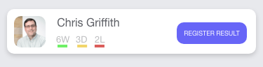
One of the things that catch my eye when I am scanning the Ionic Forums is design related questions. Sometimes these are questions around styling a component, but sometimes the poster asked for a more complex design solution. I save these, and when my schedule allows, I will tackle them. This design challenge was someone looking for a solution in the layout of a card. Here is my Adobe XD clone of the initial request (I have opted not to share the initial query).
As you can see there is an avatar, user name, game stats, and an action button.
Now I suspect the avatar might have led the poster to look at using the Ionic avatar component and in turn, the Ionic List component. Instead, I opted to leverage the Ionic Grid to solve this layout. Although there are four regions, I opted to consider this design to use two regions; one for the request button and one for the rest. While one might have chosen three regions, I wanted to make sure that the avatar was connected to the user name and game stats. By placing the user name and game stats in their own cell, it could shift positioning.
Let’s place our initial content within two columns in the Ionic grid inside an Ionic Card component:
This file contains bidirectional Unicode text that may be interpreted or compiled differently than what appears below. To review, open the file in an editor that reveals hidden Unicode characters. Learn more about bidirectional Unicode characters
We will focus on the text styling first. We will place the user name inside an h1 tag and add a CSS class of userName.
This file contains bidirectional Unicode text that may be interpreted or compiled differently than what appears below. To review, open the file in an editor that reveals hidden Unicode characters. Learn more about bidirectional Unicode characters
In our scss file we will set the following properties:
This file contains bidirectional Unicode text that may be interpreted or compiled differently than what appears below. To review, open the file in an editor that reveals hidden Unicode characters. Learn more about bidirectional Unicode characters
For the game stats, we will place it in a paragraph tag. For each stat, we will wrap in a span tag and assign each a specific CSS class for wins, draws, and losses. By doing this we can leverage the border property to create the colored bar under each stat.
This file contains bidirectional Unicode text that may be interpreted or compiled differently than what appears below. To review, open the file in an editor that reveals hidden Unicode characters. Learn more about bidirectional Unicode characters
This file contains bidirectional Unicode text that may be interpreted or compiled differently than what appears below. To review, open the file in an editor that reveals hidden Unicode characters. Learn more about bidirectional Unicode characters
Turning to the avatar, we can apply the border-radius property and also enforce a maximum width. We will address positioning in a bit.
This file contains bidirectional Unicode text that may be interpreted or compiled differently than what appears below. To review, open the file in an editor that reveals hidden Unicode characters. Learn more about bidirectional Unicode characters
This file contains bidirectional Unicode text that may be interpreted or compiled differently than what appears below. To review, open the file in an editor that reveals hidden Unicode characters. Learn more about bidirectional Unicode characters
Our final element to be styled is the call to action button. This element will be the Ionic button component.
This file contains bidirectional Unicode text that may be interpreted or compiled differently than what appears below. To review, open the file in an editor that reveals hidden Unicode characters. Learn more about bidirectional Unicode characters
The Ionic button will adapt to each platform, which requires overriding some of those settings, notably the border radius and the text case. For the latter, we can set the CSS variable for border-radius and the background color.
This file contains bidirectional Unicode text that may be interpreted or compiled differently than what appears below. To review, open the file in an editor that reveals hidden Unicode characters. Learn more about bidirectional Unicode characters
The button’s text case is not one of the listed variables. Instead, we can use of one the Ionic’s CSS utilities. For Ionic, many of these CSS styling helpers were CSS attribute selectors. But with Ionic expanding to other frameworks, these helpers have become namespaces CSS classes. So we can apply the ionic-text-uppercase case to our button.
This file contains bidirectional Unicode text that may be interpreted or compiled differently than what appears below. To review, open the file in an editor that reveals hidden Unicode characters. Learn more about bidirectional Unicode characters
That covers the basic visual styling, so let’s tackle our positioning. The Ionic grid is built upon the CSS Flexbox. Flexbox is a powerful layout solution for layout in one direction.
Since we want our content to be vertically centered, we can use the align-items-center value for a flexbox. For the Ionic grid, we declare this on the ion row by applying it via a CSS class.
This file contains bidirectional Unicode text that may be interpreted or compiled differently than what appears below. To review, open the file in an editor that reveals hidden Unicode characters. Learn more about bidirectional Unicode characters
Next, we need to define the positioning of our two ‘cells’. For this, we can use Flexbox’s justify-content-between to position them against either side. Again, this is done by adding in a CSS class.
This file contains bidirectional Unicode text that may be interpreted or compiled differently than what appears below. To review, open the file in an editor that reveals hidden Unicode characters. Learn more about bidirectional Unicode characters
Let’s deal with our avatar and the text. The solution I opted to use was to turn the image into a block level element and float it to the left. We will add some margin to the right side to bump the text over. The game stats could also use some spacing between them and the user name so we can add some margin to that paragraph tag.
This file contains bidirectional Unicode text that may be interpreted or compiled differently than what appears below. To review, open the file in an editor that reveals hidden Unicode characters. Learn more about bidirectional Unicode characters
The button also needs some layout attention as it is currently aligned to the left of the container. What we would like is for the button to be anchored to the right edge of the container. To solve this we can apply another Ionic CSS utility class — the ion-float-right class.
This file contains bidirectional Unicode text that may be interpreted or compiled differently than what appears below. To review, open the file in an editor that reveals hidden Unicode characters. Learn more about bidirectional Unicode characters
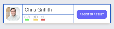
The final touch is to reduce the inner spacing of our containing Ionic card component. If you scan the Ionic documentation, you will not find a CSS variable to adjust this. But fear not! Pulling up Dev tools in our browser we can see that that spacing is applied directly, meaning we can override it without difficulty.
This file contains bidirectional Unicode text that may be interpreted or compiled differently than what appears below. To review, open the file in an editor that reveals hidden Unicode characters. Learn more about bidirectional Unicode characters
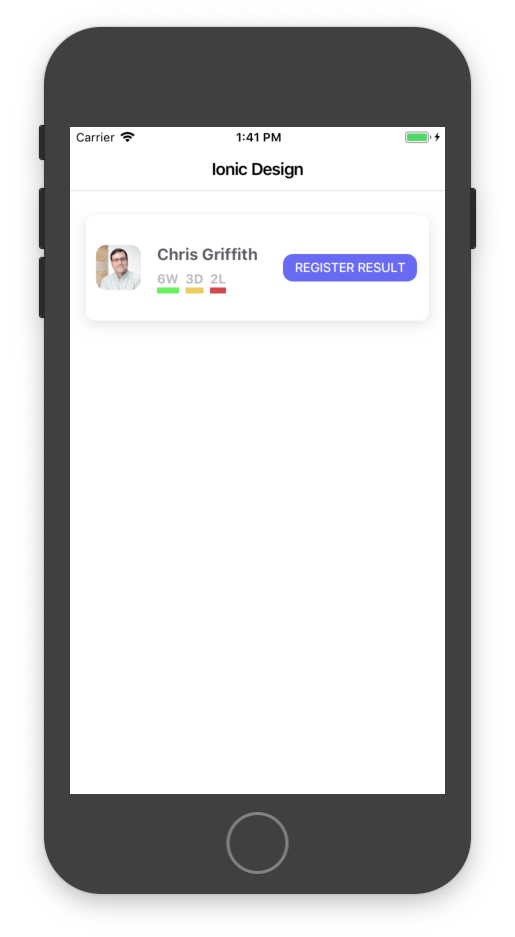
Here is the final output running on my iOS emulator.
I think the design is fairly close to what I was using a reference. To learn more about Ionic CSS Utilities, see their documentation. For more information about the Ionic grid, I suggest you read over this section in the documentation.
If you found this design exercise useful or have questions let me know.
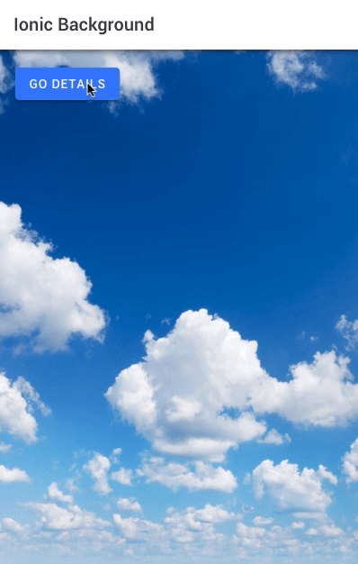
A common UI design that is applied to many mobile applications is to have an image serve as the background. This is a question that I see asked multiple times on the Ionic Forums, so I thought I would take a moment and outline the best approach to achieving this effect.
If you only need to attach your image to a specific page, just go to that page’s .scss file and define the –background variable. Here, I will set the image to reference a bg.jpg file I have in my assets directory, as well as set the parameters of how it should be rendered.
Note, the path to the asset is relative to the page’s directory.
But what if you wanted that image to be used across all of the pages? You could then move the code to the global.scss file. Since this is now being applied a global level, we need to adjust the url path:
This initially will work, but watch closely when we transition from screen to screen. The background image will either shift or blank out for a moment.
This is due to the fact that the ion-content component that we have targeted with our CSS, is being destroyed when we navigate from screen to screen. To solve this we need to remember that Ionic at its heart is still just the web. So rather than focus on Ionic’s web components, we can think about what other HTML elements we might be able to use.
The answer is to have the body tag be the element that we attach our image to. So, in the global.scss file we can add:
body {
  background: url(/assets/bg.jpg) no-repeat center/cover fixed;
}
However, if you just made that change, you will find that the image no longer is visible. This is because the default values for ion-content are being applied. Meaning, the fill color is now being used, thus covering our image. To solve this, we need to override that with:
ion-content {
  --background: none;
}
And now we will have a nice static background for the application.
In updating my book, Mobile App Development with Ionic, I was exploring ways to globally set various settings for my Ionic applications. As a general rule, much of the styling of the components are meant to be done at the component level. However, you might have several ion-refresh components scattered throughout your application. Instead of defining that component’s spinner in each instance, you can set that property globally. To set these parameters, we can pass in an object of key-value pairs to the forRoot method on IonicModule. For example:
IonicModule.forRoot( {mode: 'ios', })
in the app.module.ts file.
Here are some of the settings that you might want to adjust for you Ionic 4 application:
mode
This will set the overall platform mode of the app. It can be either ios or md.
statusTap
This boolean will enable the ability to tap the device’s status bar to trigger a scroll to the top of the screen.
backButtonIcon
To set the back button icon that the ion-back-button uses, pass in the ion-icon name or path to the icon.
backButtonText
To set the back button text that the ion-back-button uses.
spinner
If you want to globally set the style of the ion-spinner, you can use this property. Allowable values are “lines”, “lines-small”, “dots”, “bubbles”, “circles”, “crescent”.
loadingSpinner
If you want to globally set the style of the ion-loadingController component, you can use this property. Allowable values are “lines”, “lines-small”, “dots”, “bubbles”, “circles”, “crescent”.
menuIcon
If your app uses the sidemenu template, you are probably using the ‘hamburger’ menu icon. If you would like to change it, pass in the ion-icon name or path to the icon.
refreshingIcon
If your app uses the ion-refresher, you can change the refreshing icon by passing in the ion-icon name or path to the icon. This is the value that the pullingIcon attribute references in the component.
refreshingSpinner
If your app uses the ion-refresher, you can change the icon that is shown while the refreshing action is being done by passing in the ion-icon name or path to the icon. his is the value that the refreshingSpinner attribute references in the component.
infiniteLoadingSpinner
If you want to globally set the style of the ion-infinite-scroll component’s spinner, you can use this property. Allowable values are “lines”, “lines-small”, “dots”, “bubbles”, “circles”, “crescent”.
There are some properties that are related to the tab bar. Since that component just underwent a late-beta change, I was not able to verify them:
tabbarPlacement: string;
tabbarLayout: string
tabbarHighlight: boolean
The IonicConfig list contains other parameters, but I did not explore them all.
Hope this helps you build better Ionic 4 applications.


 Prototype A
You must be logged in to post a comment.